Jeremy Slagle selected as a LogoLounge 15 Juror!
Jeremy is proud to have been selected as a juror in the upcoming LogoLounge 15 book!
Press release from LogoLounge:
Meet Jeremy Slagle, a powerhouse in branding and identity design, as well as a decorated LogoLounge user! With over 30 years of experience, Jeremy is the founder of his own studio, Slagle Design, where he’s crafted impactful brands for 15 years.
On top of being a LogoLounge multi-award winner, Jeremy has co-founded Created Conference and leads hands-on Adobe Illustrator workshops.
You may have even caught him as an Adobe Live host last year!
When he’s not designing, you’ll find him on the pickleball court, as a player or founder (Unlucky Pickleball)!
We are so excited to have Jeremy on as a judge for Book 15!
New Work: Dola Jean's Pizza
Slagle Design is excited to share the brand identity for Dola Jean’s Pizza, opening in Dover, Ohio this December!
The dynamic Duo behind Park Street Pizza and Bahler Street Pizza are at it again, this time with their unique take on Detroit-inspired pizza and cocktails!


Some things never go out of style.
Like being neighborly. Sharing good food. Taking pride in your work. And doing right by the people you care about.
Those are the values that inspired Dola Jean’s—a place where timeless recipes meet modern tastes and forging deep connections within the community is the most important item on the menu.
Congratulations to Rocky & Courtney Shanower and the entire team at Dola Jean’s as they open their new new concept in downtown Dover!
New Work: Pizza Nerds


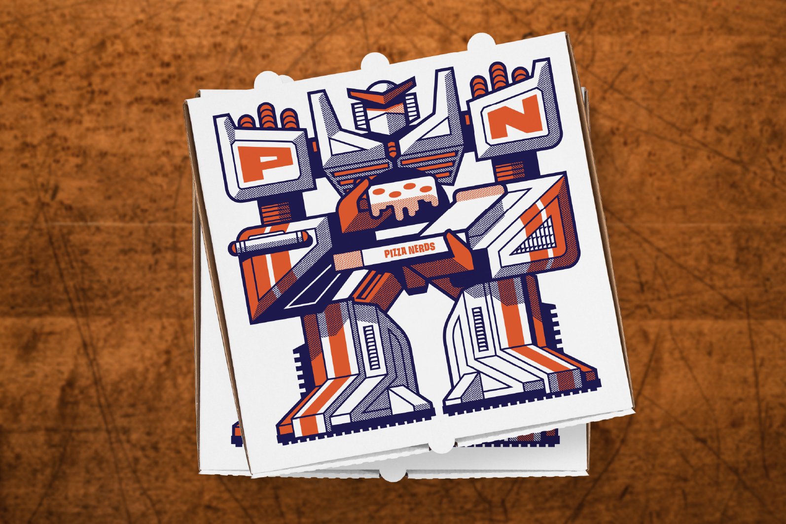
Slagle Design is excited to share the new brand identity for Pizza Nerds, Pizza & Cookies, opening December 2024
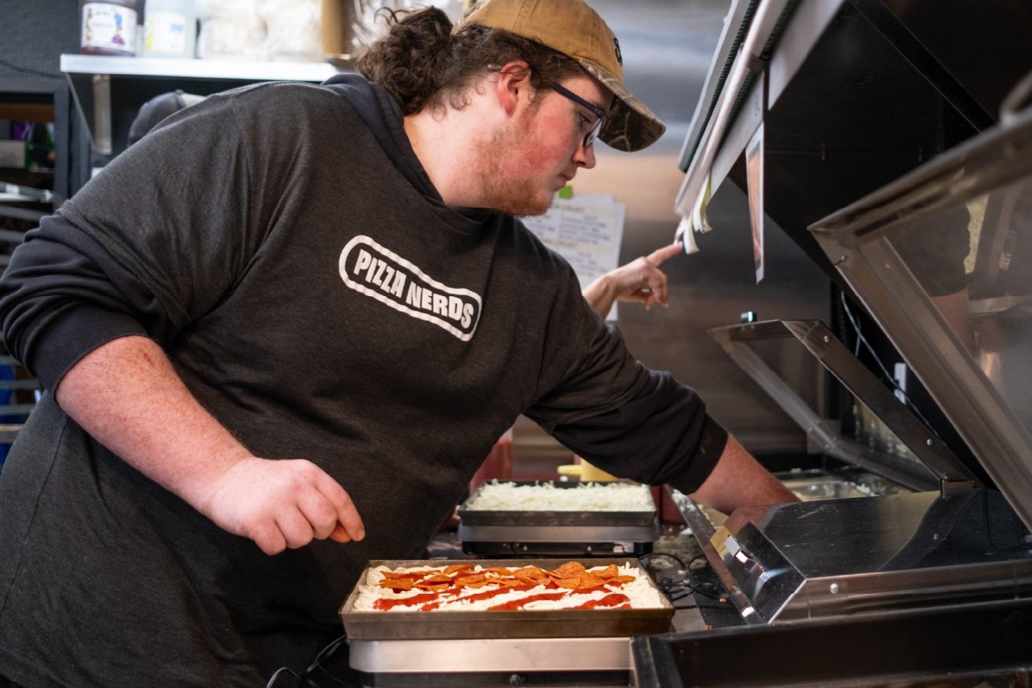
Inspired by 80’s and 90’s pop culture, Pizza Nerds is not your typical Detroit-style pizza shop. It’s a place where memories are made, vintage arcade games are played, and families and friends gather together to enjoy some of the best pizza in town.
From logo and branding to packaging, garments, interior mural, and exterior signage, this little independent pizza shop stands apart from the competition. Thank you to the owners, Brent and Katelyn, for trusting Slagle Design with their complete rebrand. It was a really fun project!
“It's hard to emphasize how happy we are with Slagle Design. Jeremy spent a lot of time with us to get an understanding of who we are and what our business is about.
He educated us on the process and why certain ideas were better than others. He communicates extremely well. Lastly, the work always blew us away. He nailed everything he created.
From start to finish the process was easy. We met three times prior to starting any designs. It helped all of us stay on the same page. The work is phenomenal. The customer service is phenomenal.
Our rebrand is perfect and we're excited to continue working with Slagle.”
–Brent Gargasz, Owner
Congratulations to Brent and Katlyn Gargasz on their new venture!
New Work: Columbus Sliders Pickleball Team


Columbus’ Premier Level Major League Pickleball team, The Columbus Sliders, has a new look for their 2025 season as they host their first hometown match and tournament since their inaugural season.
Get tickets here!
“Jeremy was able to transform our concepts into visuals in a way that cultivated our community growth. We love seeing our new logos in the community and engaging everywhere.”
Fernando Esquivel, Director of Operations, The Columbus Sliders
The previous logo was closely integrated with their founding Sponsor, White Castle’s logo. The new logo allows them to continue their partnership with White Castle and create new sponsorship opportunities with The James Cancer Hospital and others.
Go Sliders!
New Podcast: Passion Behind the Art
The Drive Behind Crafting a Unique Client Approach
I was glad to be on my friend Darold Pinnock's Passion Behind the Art Show Podcast. Thank you for the chance to hang out and share!
In this engaging conversation, graphic designer Jeremy Slagle shares his journey in the design industry, discussing his unique approach to client relationships, the debate around retainers, and the importance of understanding client needs through immersive experiences. He emphasizes the significance of problem-solving in design and the necessity of clear communication to avoid bad client relationships. Slagle's insights provide valuable lessons for both aspiring and established designers. In this conversation, Jeremy Slagle shares his journey as an entrepreneur, emphasizing the importance of working with small business owners, maintaining low overhead, and understanding client needs. He discusses the value of unique branding, the process of gathering client reviews, and the role of SEO in attracting business. Jeremy also highlights the significance of personal projects in generating work and expresses his discomfort with traditional sales strategies. He advocates for a frugal lifestyle that allows for personal freedom and discusses his payment processes in freelancing. The conversation concludes with personal insights and where to find more about Jeremy's work.
New Work: Bookmark: A Classical Library


BOOKMARK is a gathering place for the early readers and deep scholars alike, for thinkers and dreamers and knowledge-seekers, a place where knowledge is preserved and celebrated.
It is open to all with a keen eye toward age-appropriate considerations for all readers. But Bookmark is more than a place where wisdom and ideas are housed – it is intended as a vibrant hall for group discussion, knowledge sharing, and meaningful civil exchange. We envision a space where homeschool programming can occur, ministries can convene, authors can visit and engage the community, and opportunities to advance the library’s mission can be met.
“Having known Jeremy for several years and admired his work, I knew I'd love the final product. However, I was not expecting the additional value Jeremy brought through his creative process. Not only did we get a clean, creative, and on-point brand for Bookmark, but we also grew in our own understanding of what we want Bookmark to be. Slagle Design is not money well spent, it's money invested well!”
David Baker, Founder
New Work: Alara
Slagle Design is excited to share a recent partnership with Alara Cincinnati.
A world away from ordinary, Alara invites you to an immersive fine dining experience that encourages exploring, sharing, and tasting your way through innovative dishes that are expertly prepared and exquisitely presented. With an open kitchen that fosters a social atmosphere, Alara strips away the conventional formalities of fine dining while focusing on food quality and next-level hospitality in a lively yet elegant setting.
To keep with the overarching theme of “flight,” we were also commissioned to create an impressive 7 ft x 21 ft triptych that is installed prominently over the main kitchen. This artwork features a Green Heron, a bird that is native to Ohio and is often seen in the surrounding areas. The watercolor brush strokes and vibrant colors that bring the heron to life were also thoughtfully integrated into other elements, such as menus, coasters, matchboxes, and various other branded touch points throughout the restaurant.
“I’ve had the pleasure of working with Slagle Design to create a brand identity for our hospitality company and several of our restaurant locations. On each project, Jeremy and his partners engaged our team in insightful conversations listening closely to capture our vision, values, and goals. Each design package he delivered provided us with a visual identity that perfectly captured the essence of our brand and exceeded our expectations. Throughout the process, he and his partners were professional, communicative, and responsive to feedback, making the experience collaborative and enjoyable. I highly recommend Slagle Design to any business looking to elevate its brand and make a strong impact through thoughtful and effective design.”
Nancy Parrot, VP of Marketing
Celebrating 15 years!


Slagle Design is proud to commemorate 15 years of collaborating with people who are dedicated to their mission.
From breweries and universities to small businesses and Fortune 500 companies, as well as century-old establishments and startups, we have partnered with a diverse range of organizations. In every instance, it is the people behind the products that drive their success.
We extend our heartfelt gratitude to everyone who has placed their trust in us with their brand identities over the past 15 years. You have welcomed us into your factories, roasters, restaurants, campuses, and creative spaces. You have shared your journeys and allowed us to engage with your clients. Your commitment, hard work, and often personal investment demonstrate your dedication to creating meaningful work. Your efforts are vital to serving your community and enhancing the world around us. We are truly fortunate to collaborate with you. Entrusting us with your branding is a responsibility we hold in high regard.
Here’s to many more successful years ahead.
New Work: Pickle and Chill


Slagle Design is excited to share the work we did this summer with the folks at our favorite indoor pickleball club, Pickle & Chill!
The project aimed to elevate the brand while staying true to their vibrant colors and overall fun aesthetic. As the former tennis facility rapidly expanded, it celebrated new partnerships with Ohio State University Medical Center, which highlighted the pressing need for improved way-finding and a more welcoming entryway.
We focused on designing clear signage that guides visitors effortlessly throughout the space, ensuring everyone can find their way to the various activities and amenities Pickle & Chill offers. Additionally, the entryway redesign emphasizes a warm, inviting atmosphere, making members and newcomers alike feel right at home. The blend of functionality and playfulness in our designs captures the energy of the club, enhancing the overall experience for all who visit.


