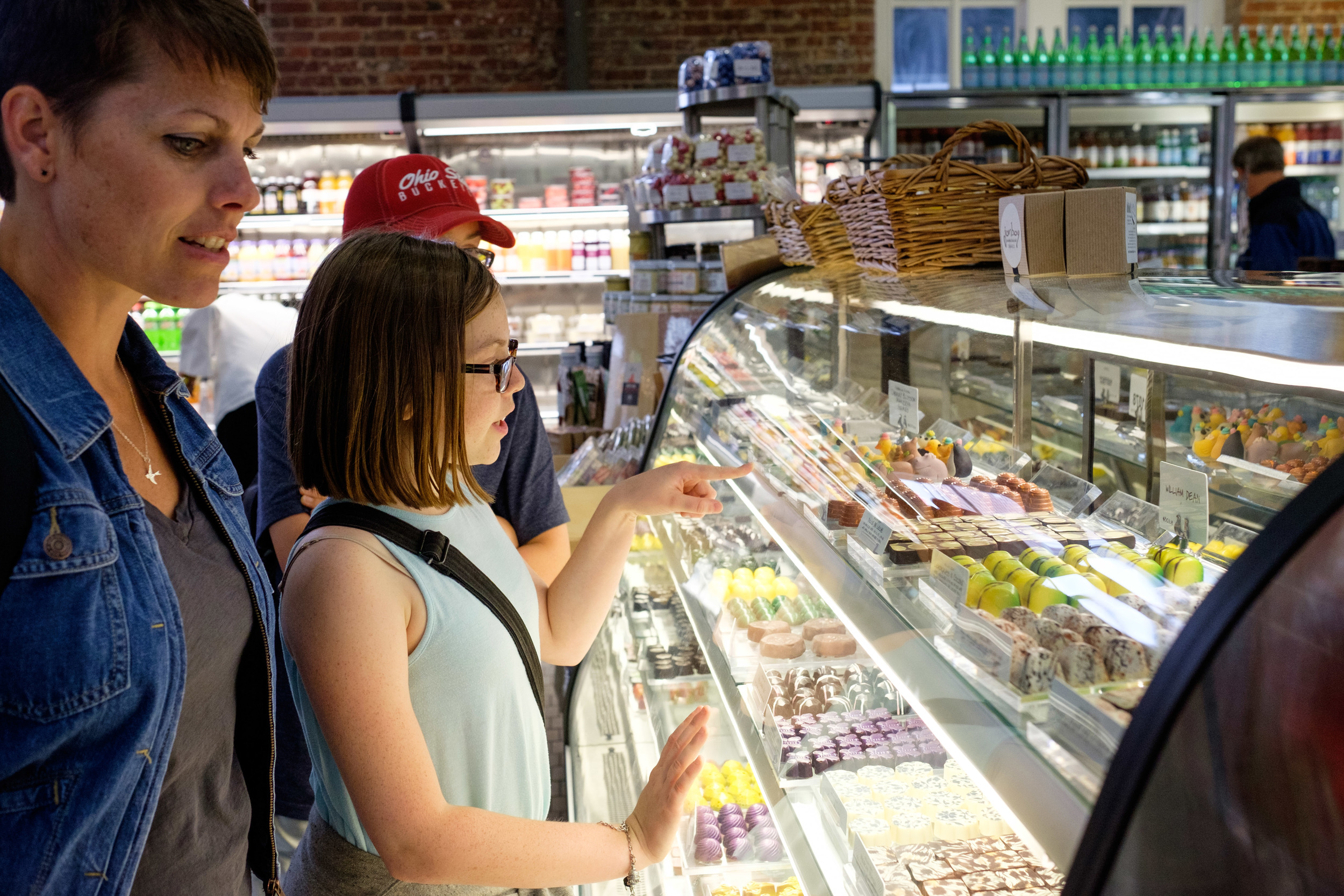
My friend Joe and I hit the Short North this evening and asked total strangers if we could take their pictures. We brought the instant photo printer along to leave them with a token of our thanks. We even made some new friends along the way.
Photo Shoot for OneWrite
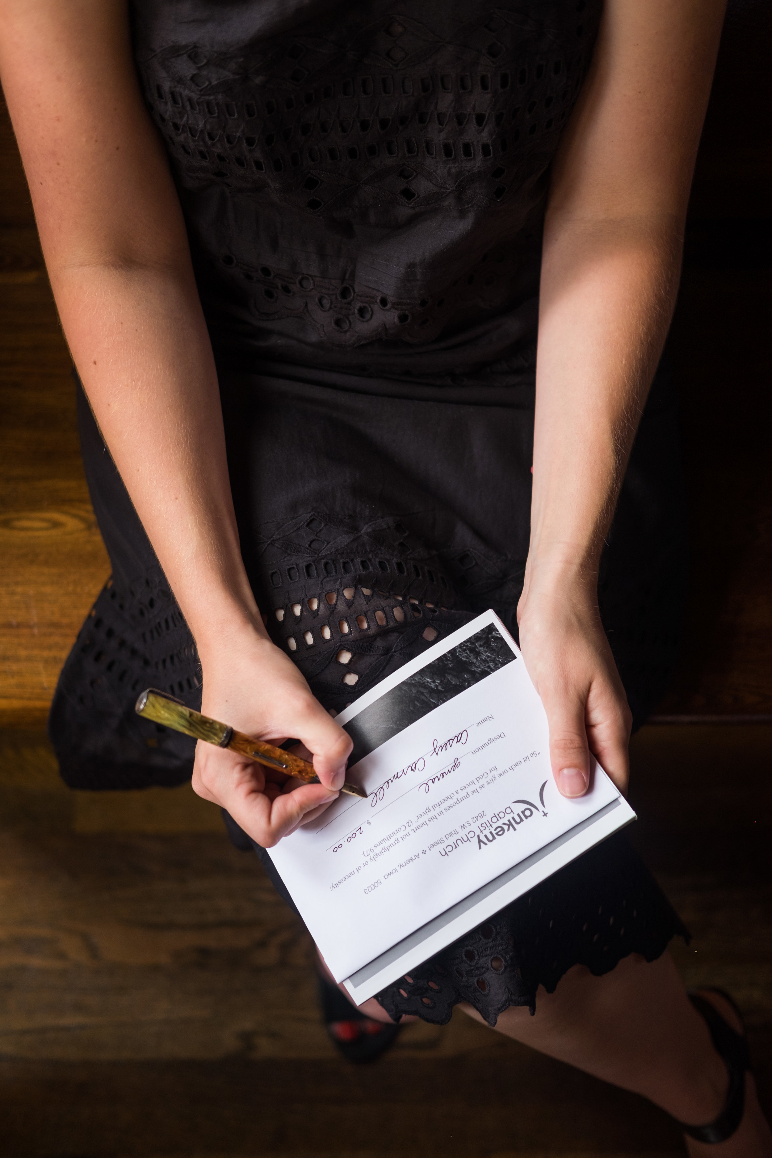
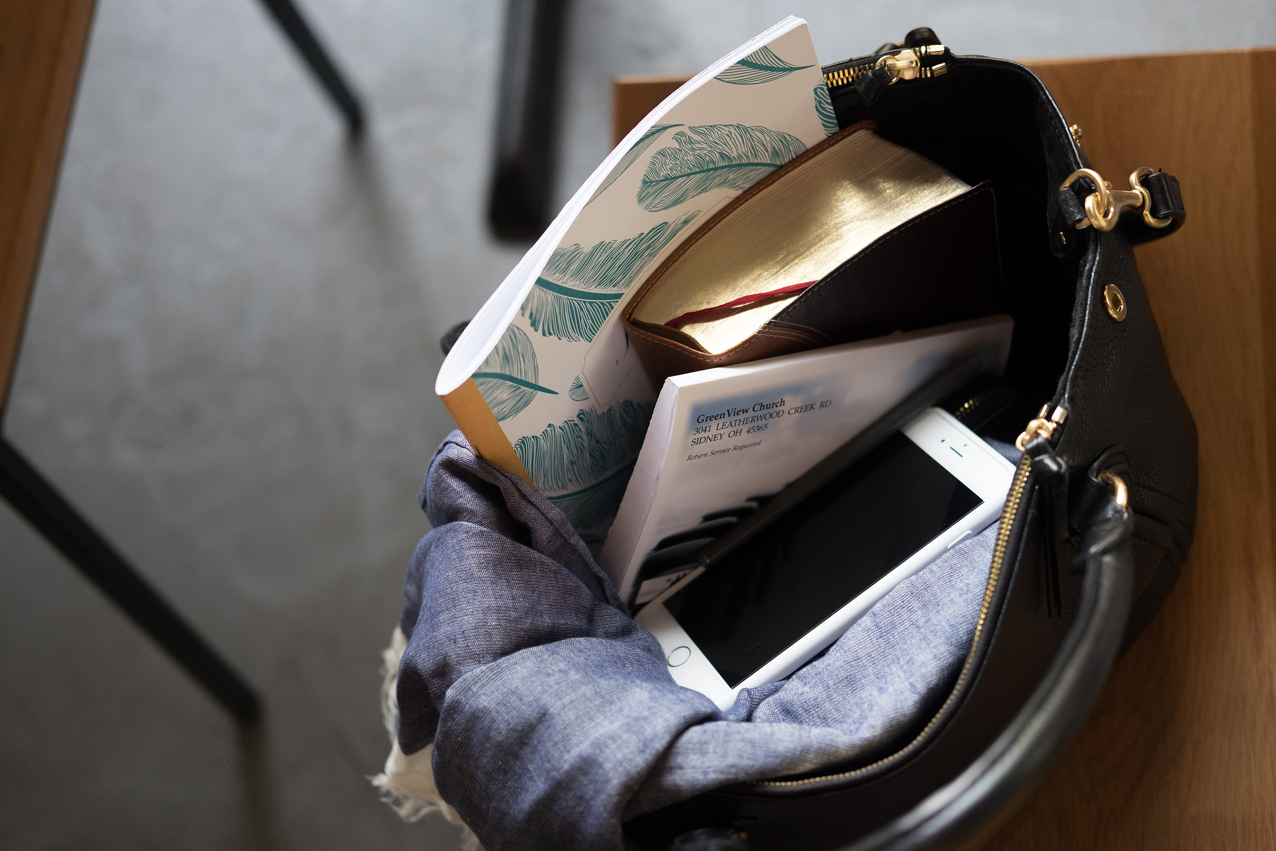
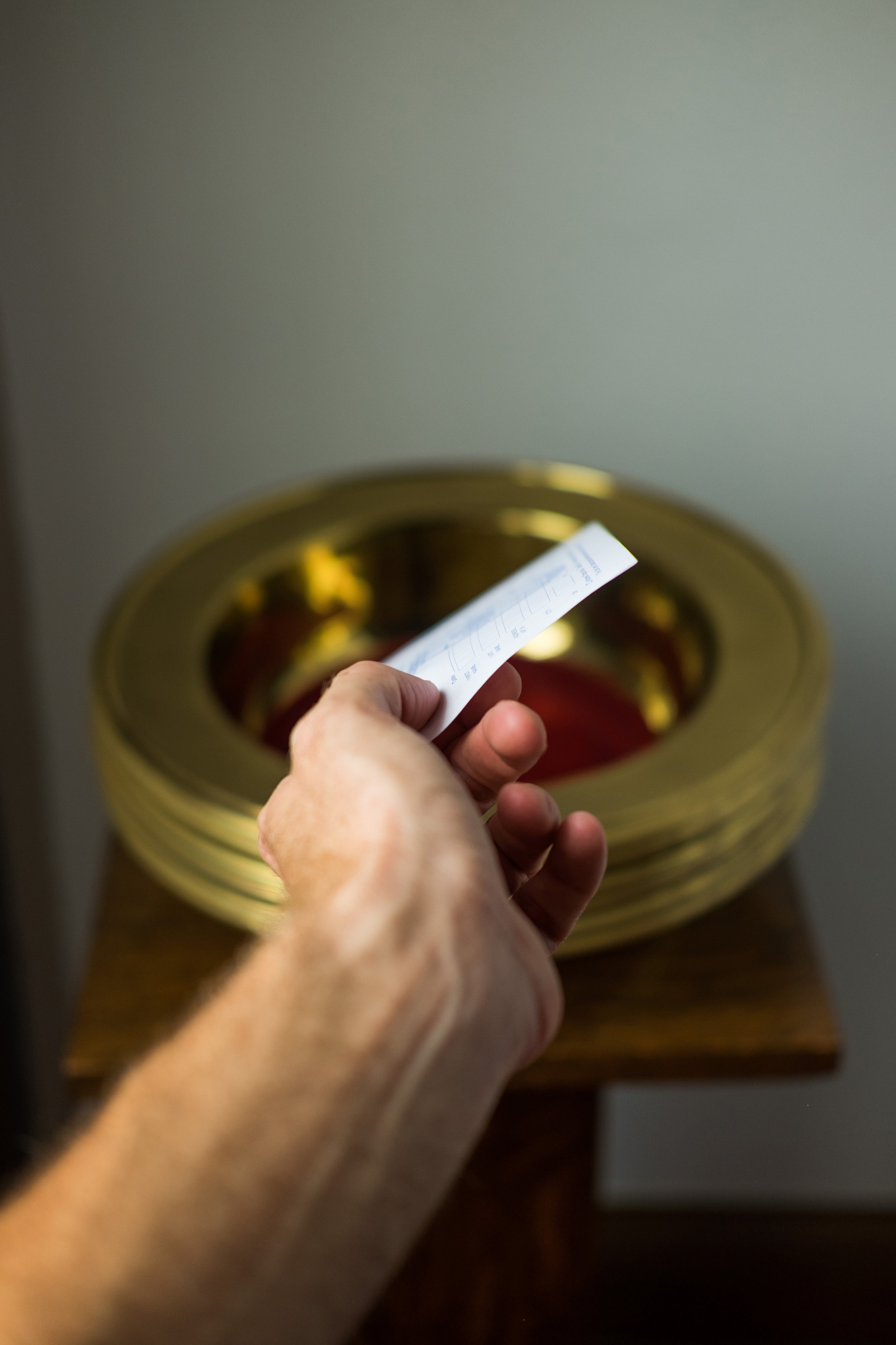
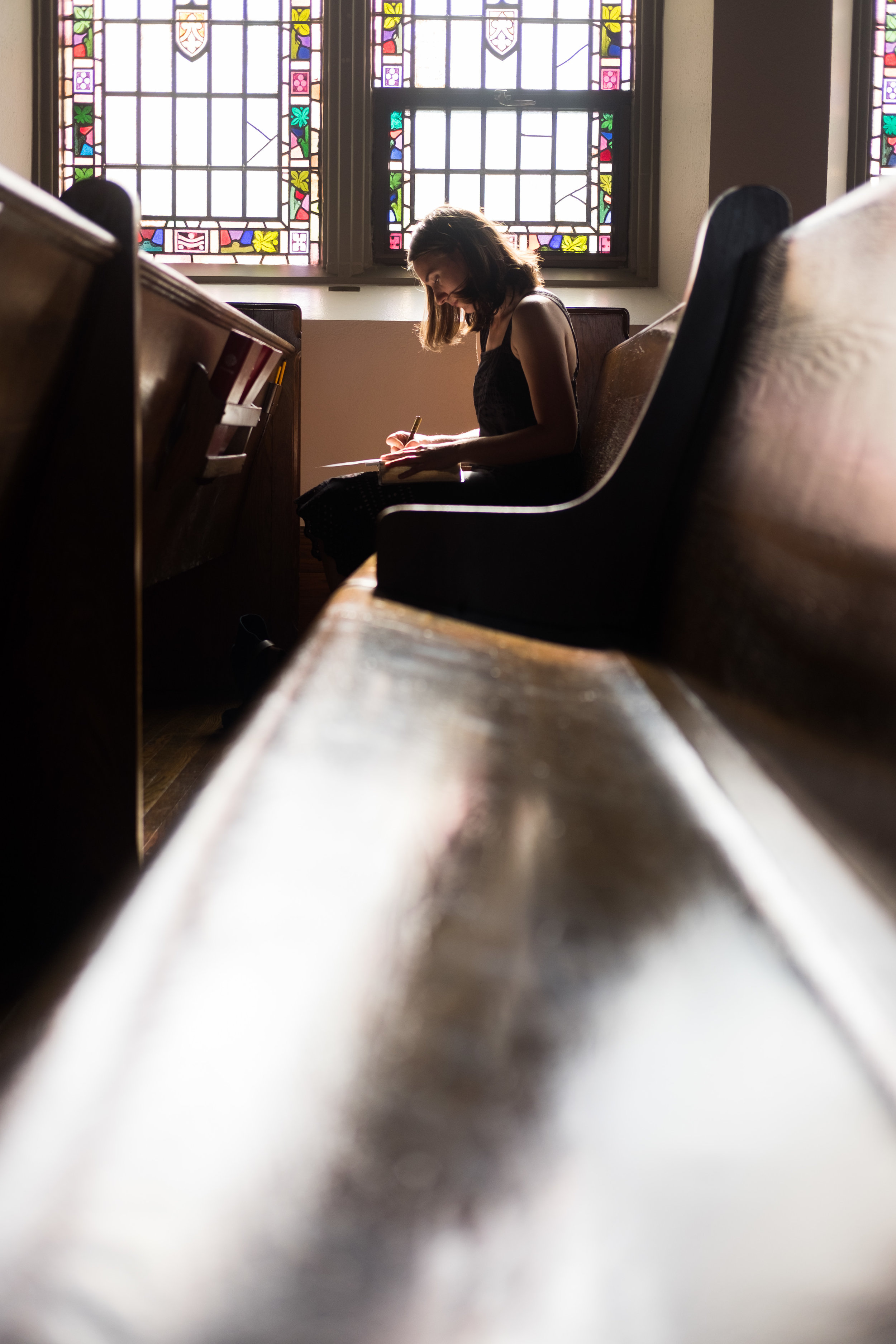
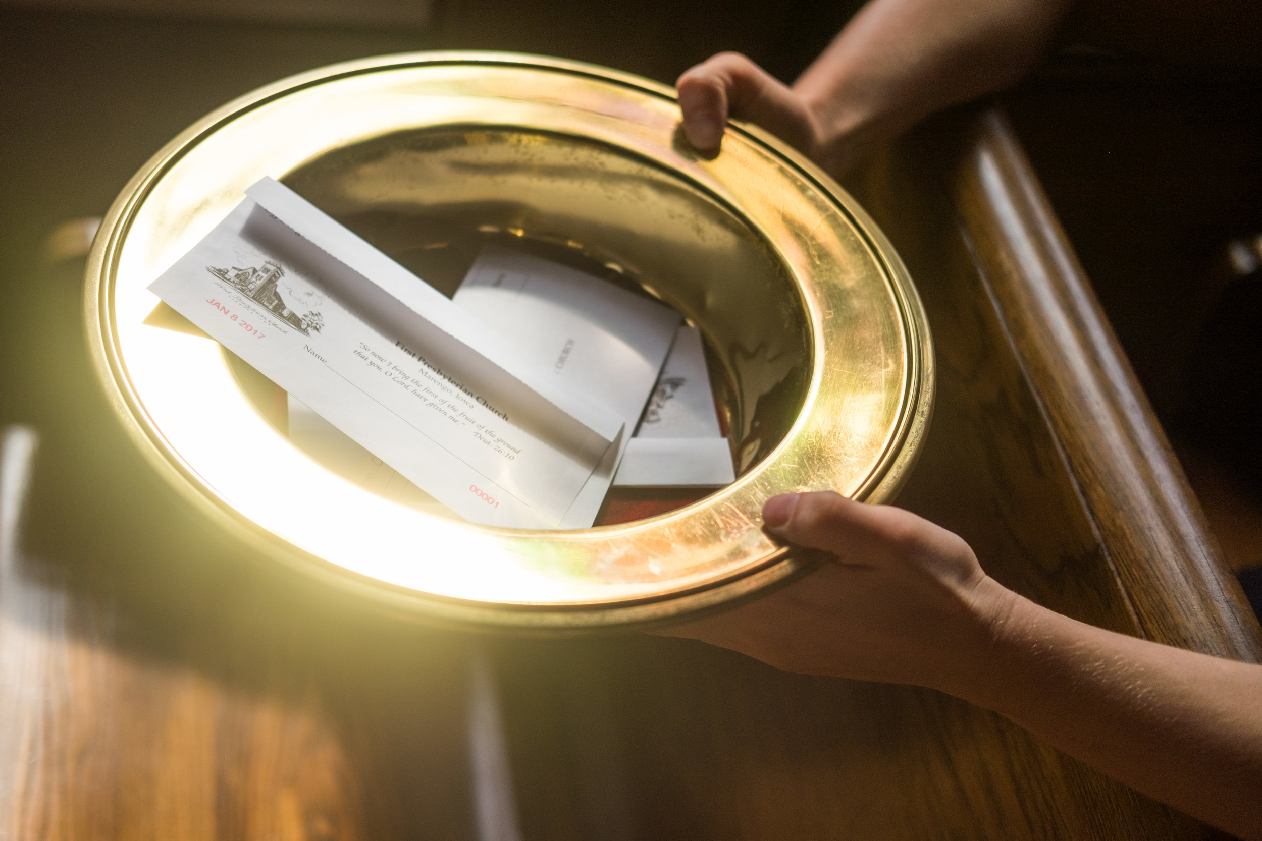
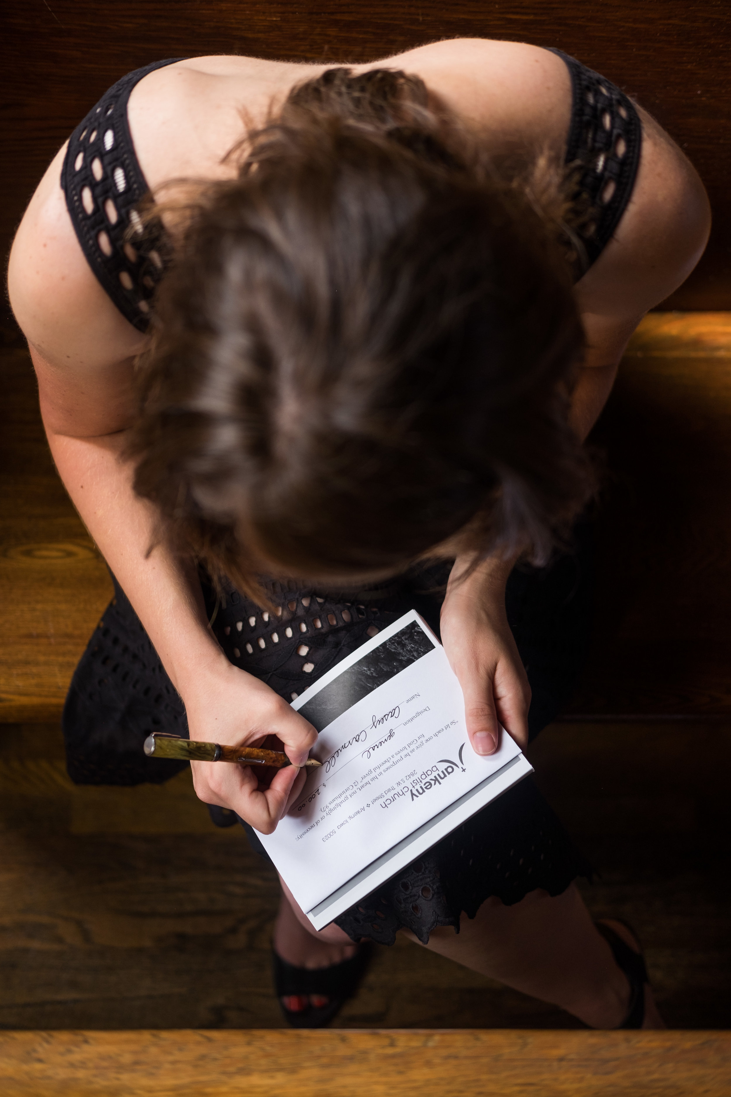
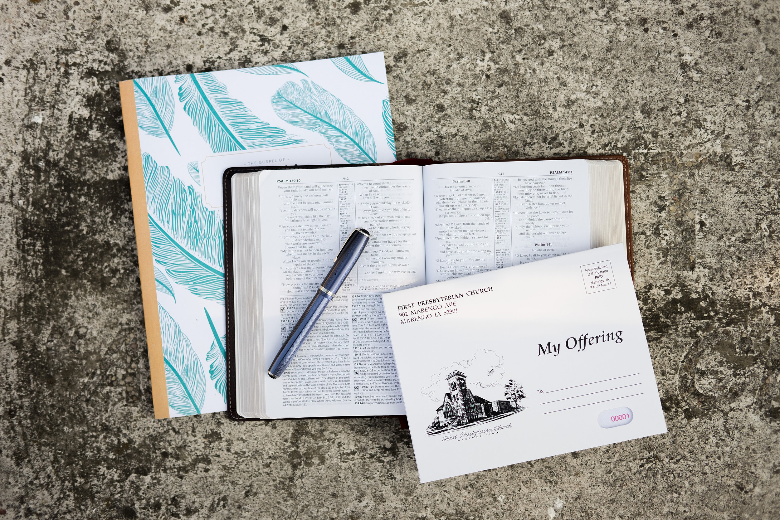
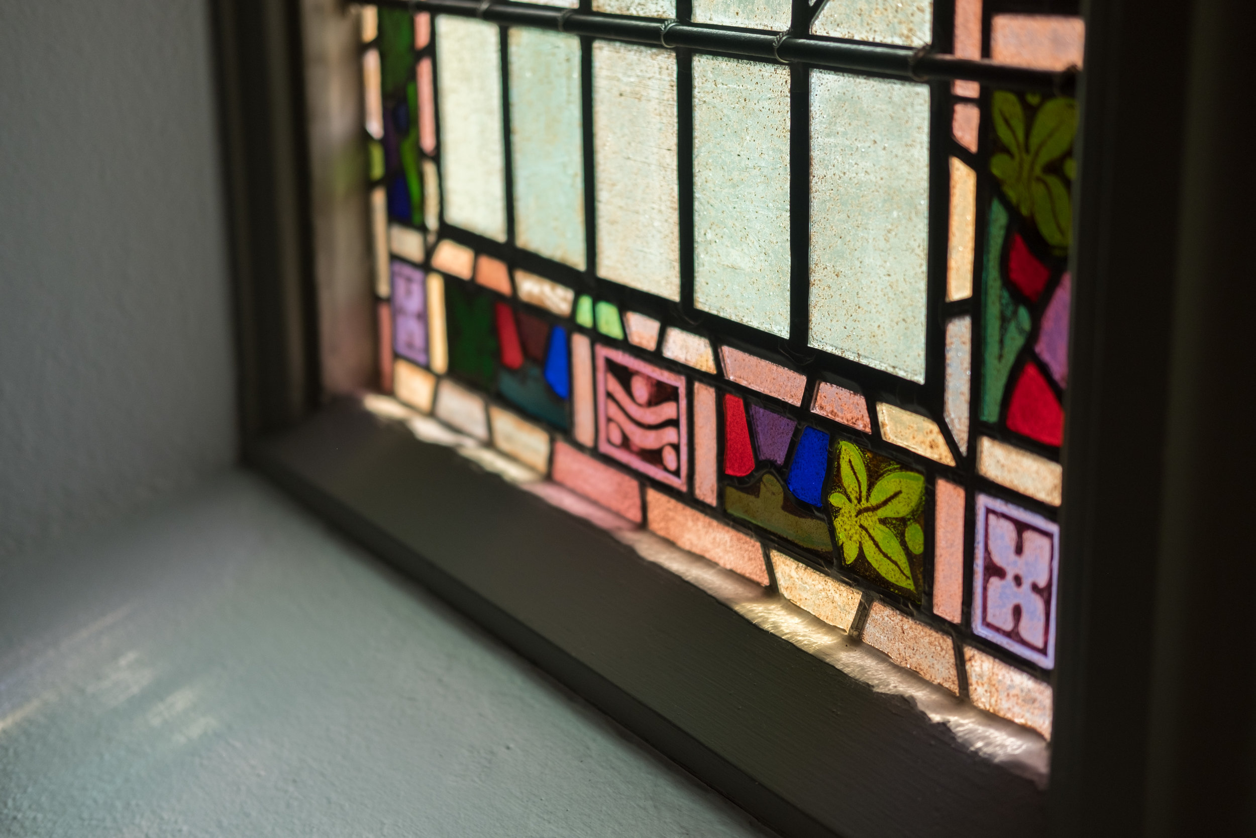
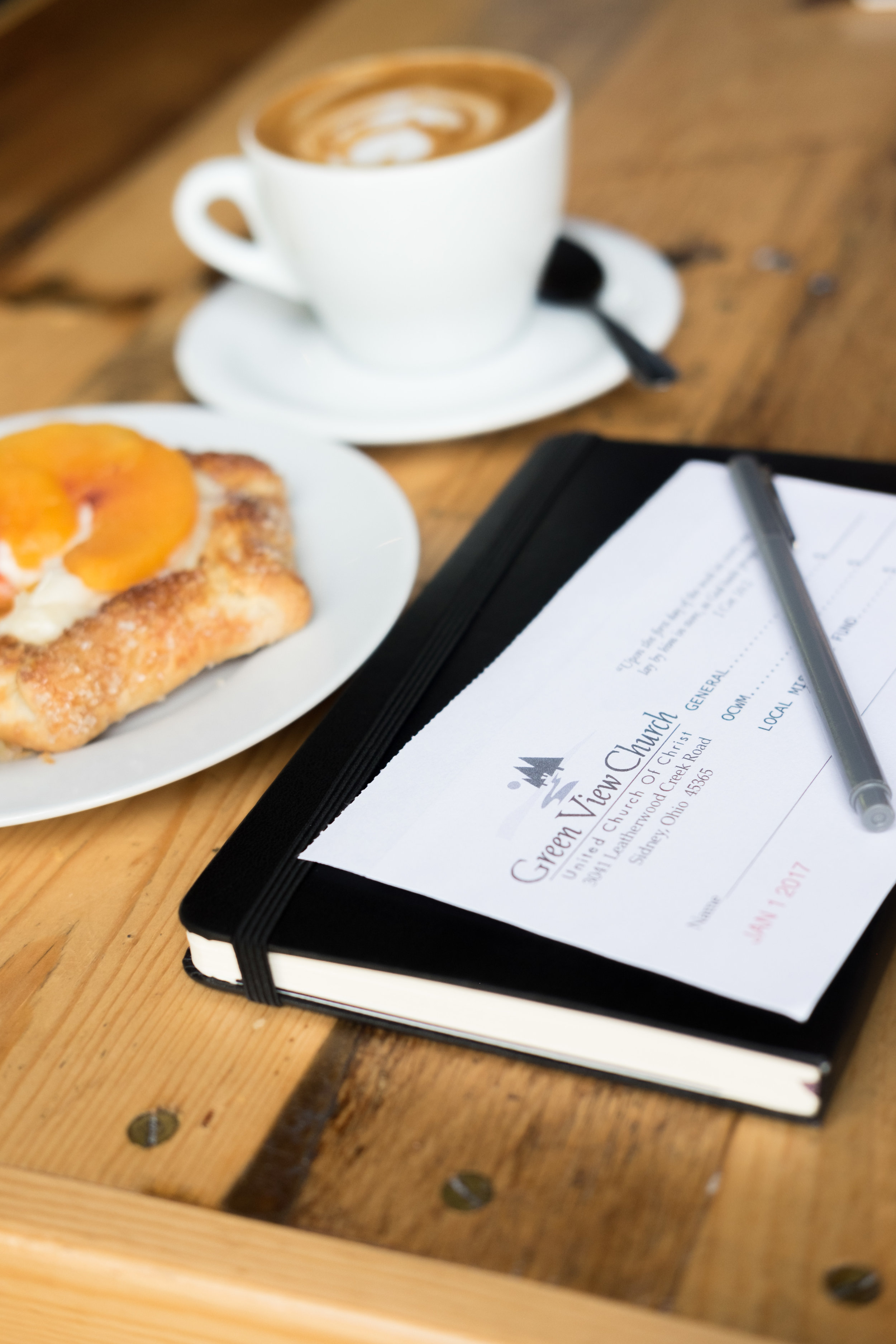
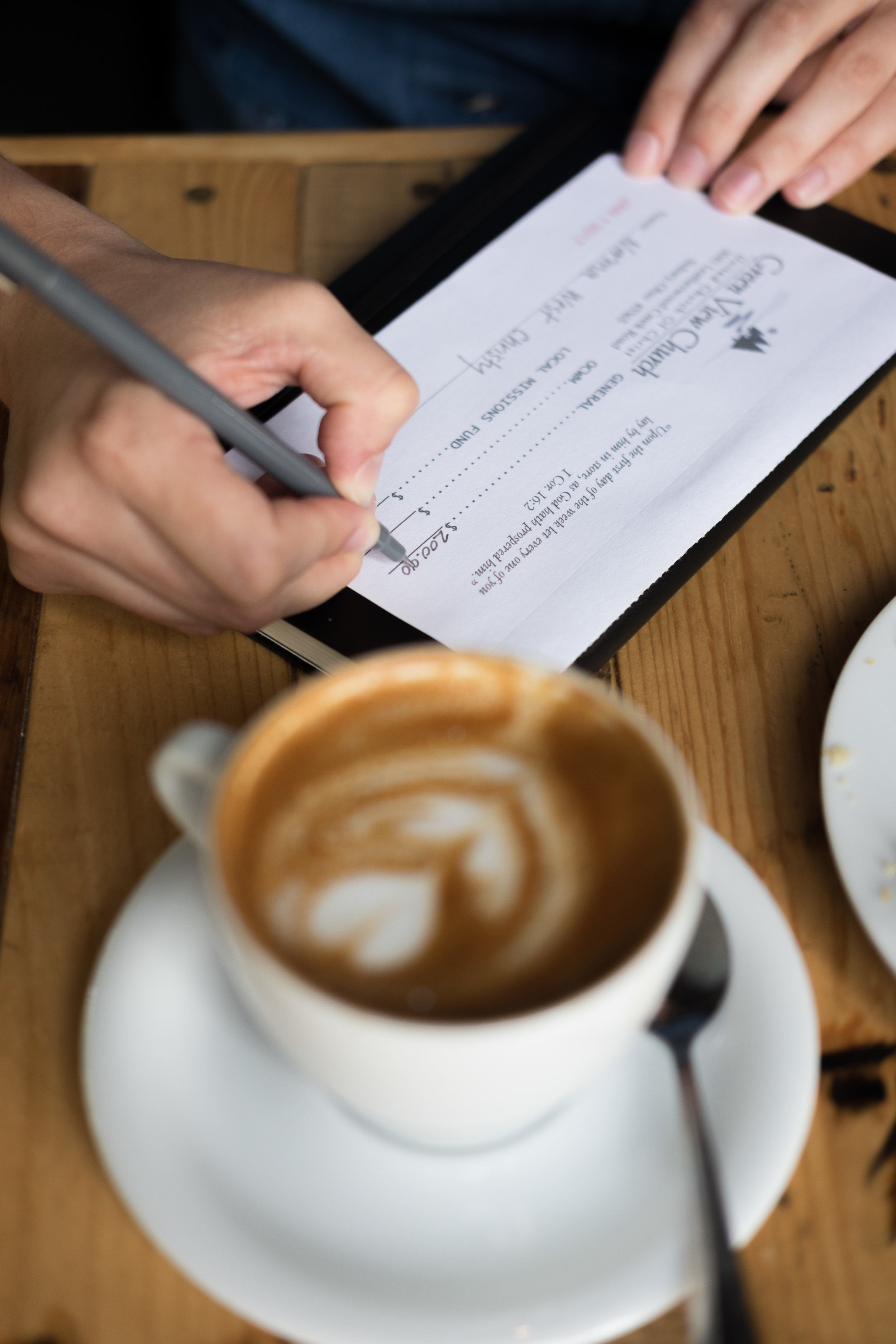
Here are a few photos a recent shoot for one of our clients who prints and sells church offering envelopes. All photos are shot in ambient light with a Fuji X-T10 and 35mm f2 WR lens.
Taking an unconventional path — with Jeremy Slagle
Designer and illustrator Jeremy Slagle discusses how art was more than just a school elective and more like a life preserver. Jeremy shares with us the anxiety and euphoria of his craft, his perspective on staying relevant and the importance of finding community.
Using the Fujifilm X-T10 in Washington DC
Last November, my good friend, Dylan, invited me to travel to LA for the Adobe Max conference and am I glad he did!
Not only was the conference amazing (I'm already registered to go back in 2016)! At the and of the opening session, to celebrate the 25th anniversary of Photoshop, they announced that everyone in attendance would go home with a brand new Fujifilm X-T10 and 18-55 lens kit! As a Canon shooter, my initial thought was “That’s cool. Maybe I’ll sell it on Ebay and pay myself back for some of the conference.” But once I opened the box, I knew I was in love. It was built like a tank. The classic style, small size, a lens felt better than any Canon lens I own, and the dials—oh, the dials. It was such a departure from my Canon DSLRs where everything is on a screen. It was tactile, and although new, felt very familiar. I was smitten...I was in deep smit.
Since then, I have purchased the 14mm f2.8, 18mm f2, 35mm f2 (LOVE), 56mm f1.2, 27mm f2.8 (probably gonna sell it), and the 23mm f1.4 (AMAZING) hand grip and thumb rest. As you can tell, I’m hooked. This camera literally goes EVERYWHERE with me. My wife and kids may be planning an intervention.
I have read of many other photographers making the big switch from Canon or Nikon to Fuji. I’ve been tempted to do so myself. After bringing both kits along for a photoshoot earlier this year, the Fuji performed admirably in the field and I actually enjoyed shooting it much more, but the real test came when comparing raw files in Lightroom. In low-light (which all of this project was) the full-frame Canon had the Fuji beat hands-down when it came to noise and detail. That being said, I’m honestly not sure if my clients could tell the difference between the two files. As far as color and AWB, the Fuji was the clear winner. I barely had to make any adjustments in Lightroom. If I was shooting weddings or photo journalism and not as much commercial work, it would be a no-brainer to make the switch. I am now eagerly awaiting the Fujifilm X-T2 rumored to arrive this summer. If they can close the gap enough with Canon when it comes to low-light performance, it may be enough for me to make the switch this year. I’d happily sell my entire Canon system for something that brings me this much joy to shoot. And, at the end of the day, I'd say that’s the most important thing.
Last week, my family took a vacation to Washington DC and, of course, the camera and lenses were with me for the entire trip, safely tucked away in my Lowepro Slingshot Edge 250 AW with Peak Design Capture Pro attached to the strap for easy access. Most of my photos were shot inside museums or at night and this camera, once again, blew my mind.
As an aside, I also picked up a Fujifilm Instax Share Printer and printed photos for my kids along the way. It was such a blast! They are far too young to have any recollection of printed photographs, much less instant prints. The joy they got from watching the images develop before their eyes was worth the price of the printer and then some.
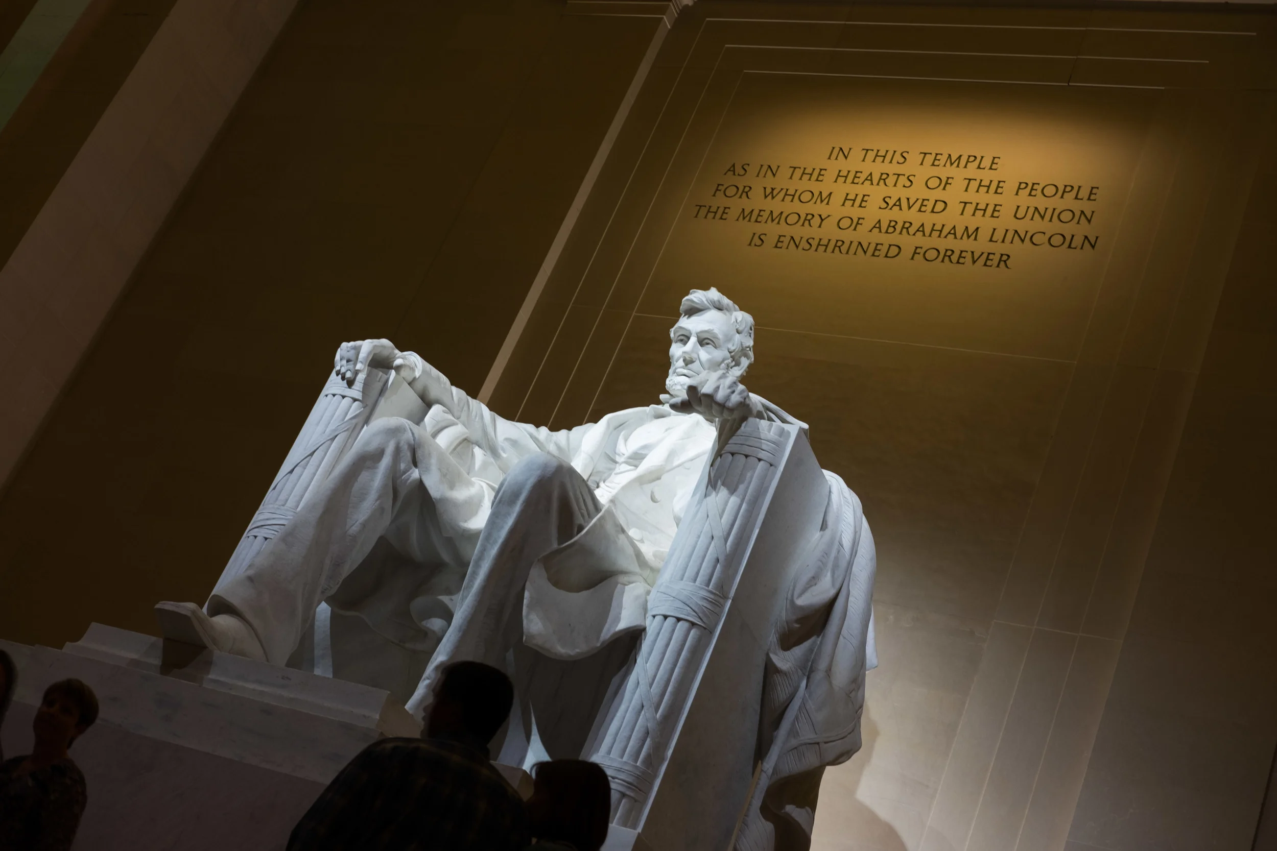
The Lincoln Memorial at night
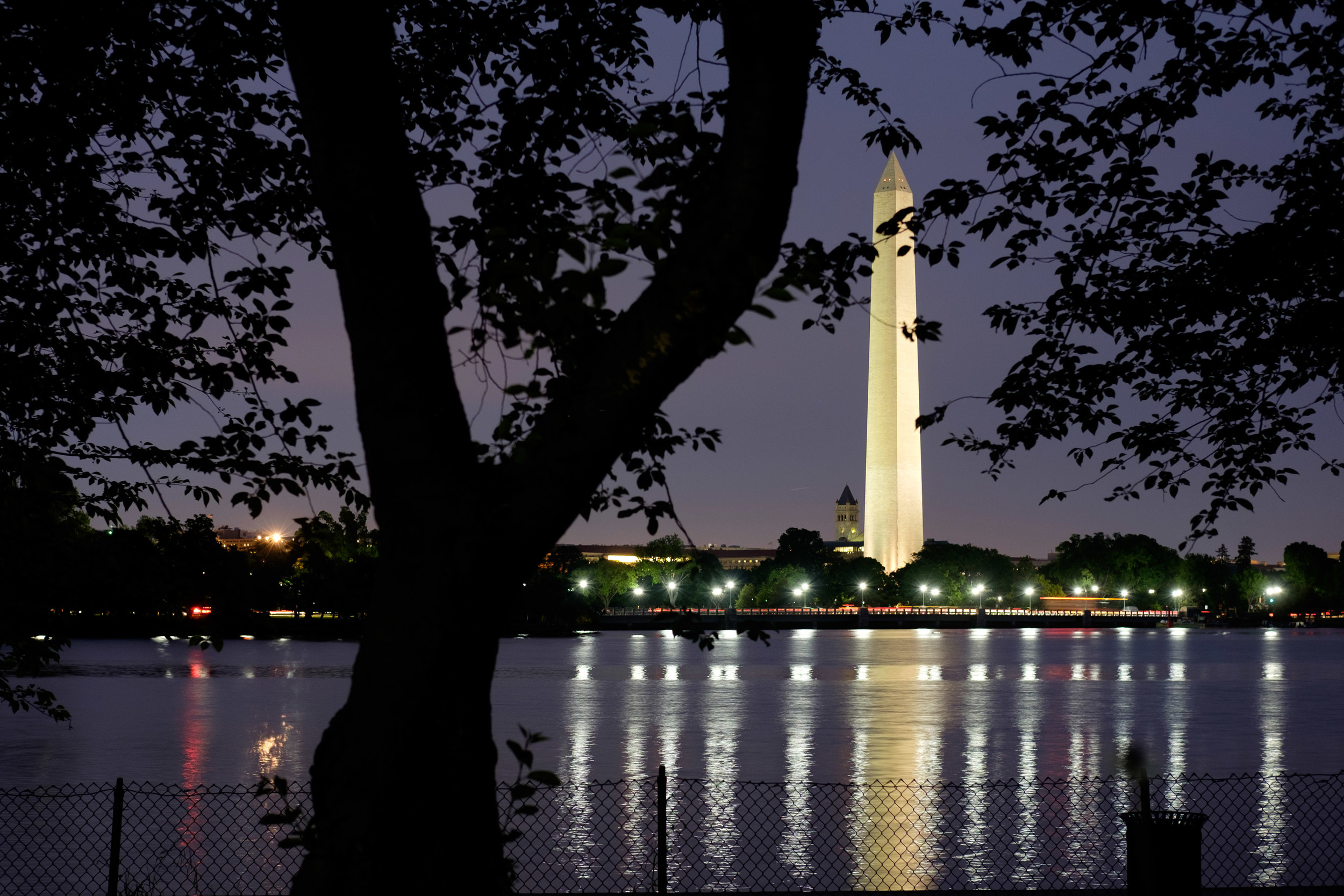
The Washington Monument, shot from the FDR Memorial
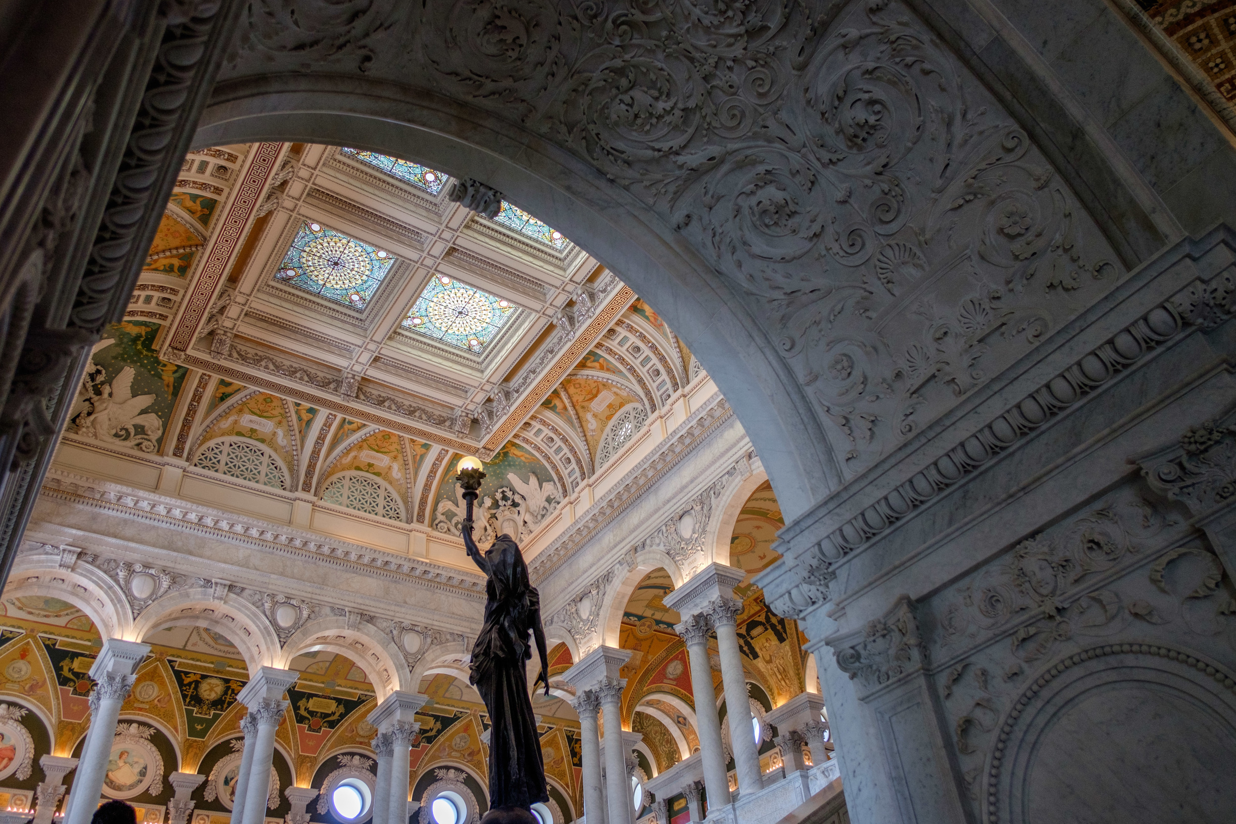
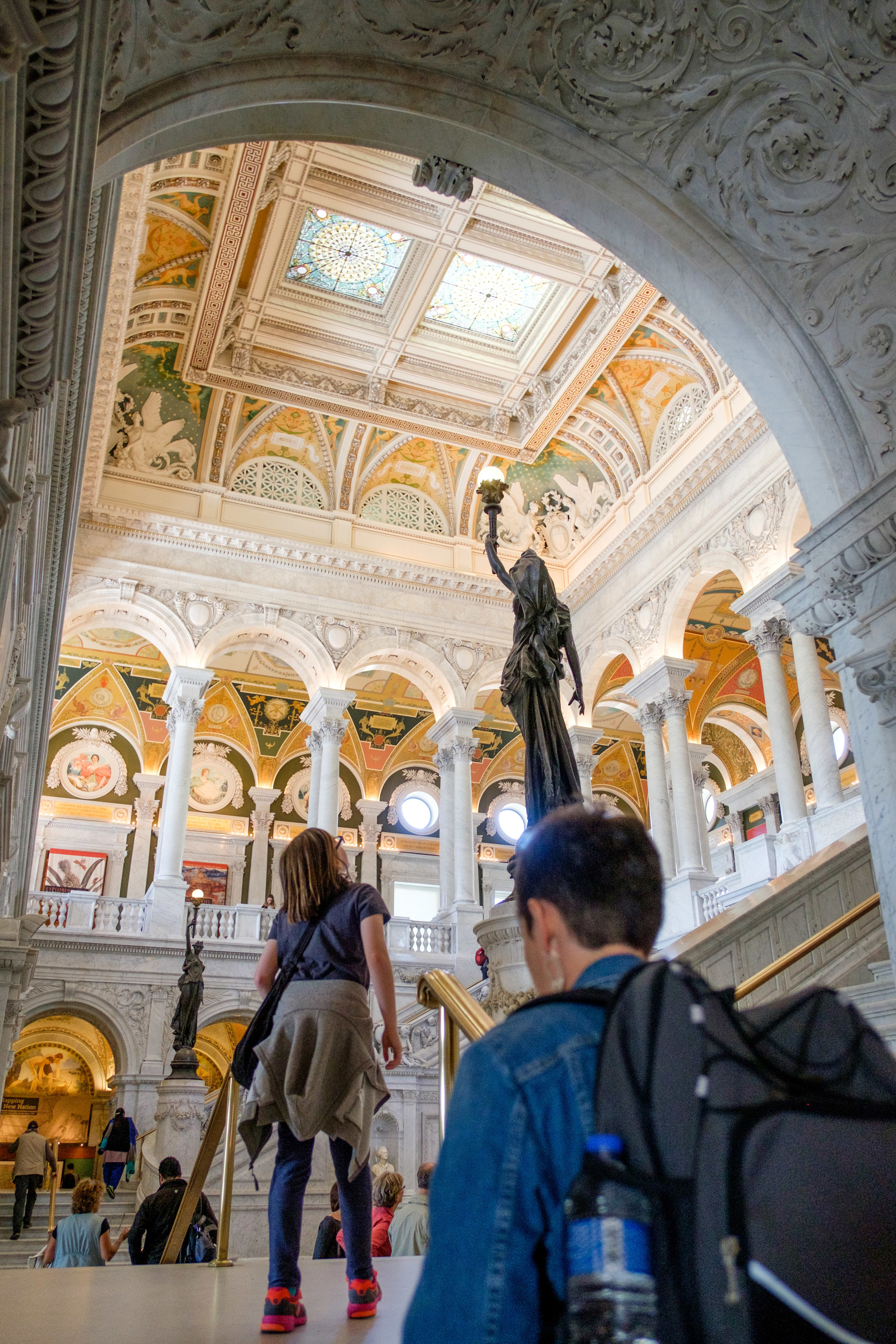
The Library of Congress
The Library of Congress
The Library of Congress
The Capitol Mall
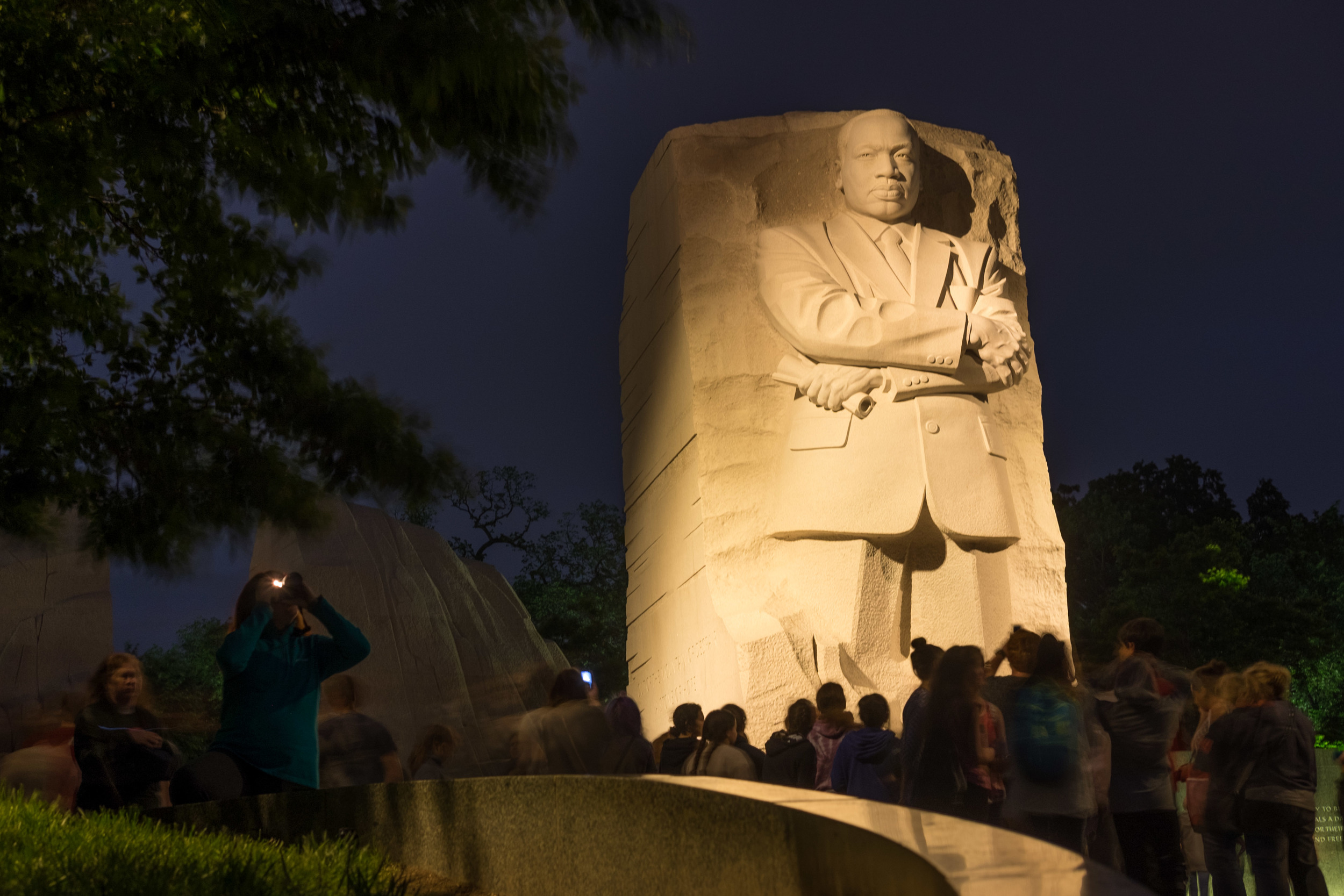
The Martin Luther King Memorial at night
The Smithsonian Air and Space Museum
The Smithsonian Air and Space Museum
Dean and Deluca, Georgetown
The Whitehouse, photographed from the top of the Washington Monument
The Washington Monument shot from the MLK Memorial at night
Window shopping in Alexandria
The Supreme Court
The Lincoln Memorial at night
This summer, I’m headed back to Cambodia and I CANNOT WAIT to bring this camera along. This is my fourth trip and in the past I have either travelled with a point-and-shoot or with my 5D MkII and 40mm pancake lens (still too big). To be able to bring a whole lens kit with me will be amazing!
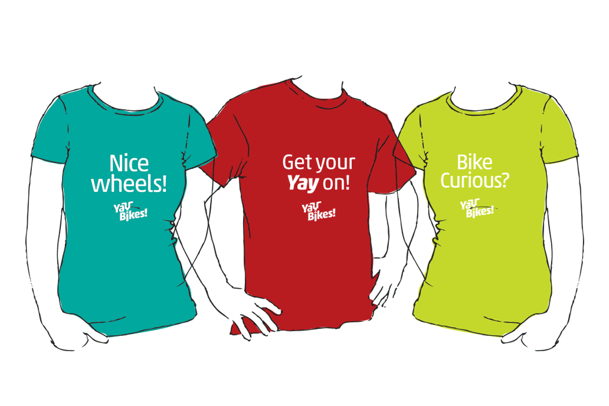
Yay Bikes! Brand Enhancement
Slagle Design in partnership with Ratchet Strategy + Communication worked with Yay Bikes! to revitalize their well-recognized and beloved brand.
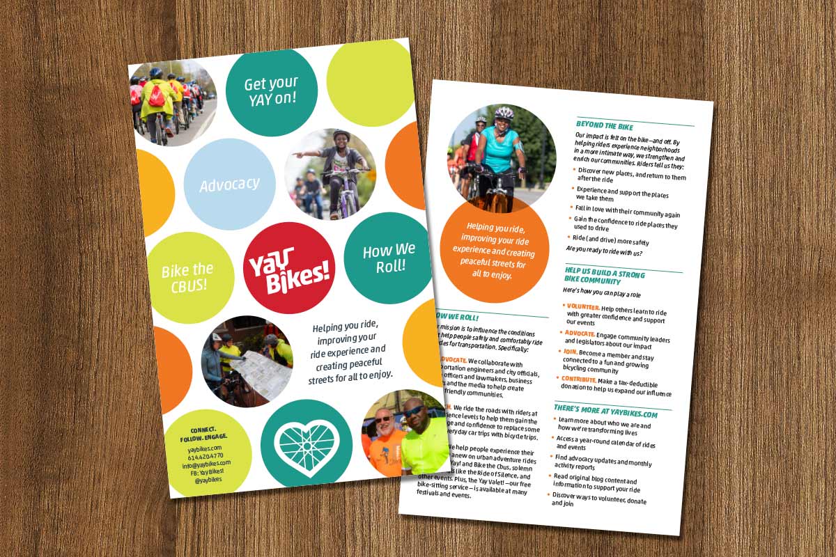
Our mission was to raise the profile and presentation of the Yay Bikes! bike corral – as well as provide the community and users of the bike corral with relevant information that compels them to new or increased levels of engagement with Yay Bikes!
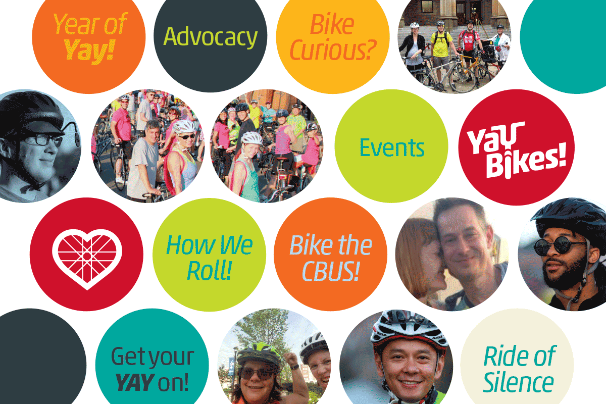
Over the years Yay Bikes! created several events and educational opportunities, each with their own name and unique logo. This has lead to a lot of confusion. Through our meetings and conversations to address the bike corral and articulate the Yay Bikes! multi-faceted story, we recognized an an opportunity to do more than simply deliver these specific deliverables. We recognized the potential in a cohesive and consistent brand identity.
By looking across all of the organization’s activities, we saw the potential in enhancing the brand in ways that would help it better fulfill its mission and engage its target audiences, elevating the Yay Bikes! brand to its proper position as the organization that truly represents the educational, event-driven, advocates of bicycle fun, safety and transportation in Central Ohio.
A refined brandmark
The existing Yay Bikes! brand was well-recognized and the concept was solid. No need to reinvent the wheel. However, as the organization is increasingly involved in advocacy, working with local law enforcement on safely initiatives and local government on policy issues, it was apparent that the brand needed to be able to appeal to a more diverse audience, allowing them to be taken seriously by city engineers, officials and legislators while not losing the fun of their community rides and educational events.
The new logo appeals to a more diverse audience, allowing them to be taken seriously by officials and legislators while not losing the fun of their community rides and educational events.
By building upon the success of their existing logo but standardizing the font, spacing, angle, and line width we were able to better bridge the audience gap while making it easier to read at a distance as well as at small sizes.
The new Yay Bikes! logo is streamlined, allowing it to be read more legibly at smaller sizes.
Brand consistency
To elevate the Yay Bikes! brand, we also created a standard for the various sub brands and renamed the “Pedal Instead Bike Corral” to “Yay Valet!” further reinforcing the ties to the Yay Bikes! brand.
The sub brands were diluting the strength of the core brand and it became apparent that most people didn't realize they were related.
“It always feels risky to entrust your identity to a design team, and so it was for Yay Bikes! to engage Slagle Design for our rebranding and bike corral redesign.
There’s no possible way they could successfully distill all of 'Us' into a simple visual design. Right? But this time? Sweet, sweet relief! They! got! it! They listened, and they translated what they heard into design elements more 'Us' than we knew possible.
Slagle Design and Ratchet Strategy gave Yay Bikes! a very rare, very special gift: a way to advance our mission through design that actually works to tell our story. We're so grateful for this process and its outcome!”
—Meredith Joy, Program Director, Yay Bikes!
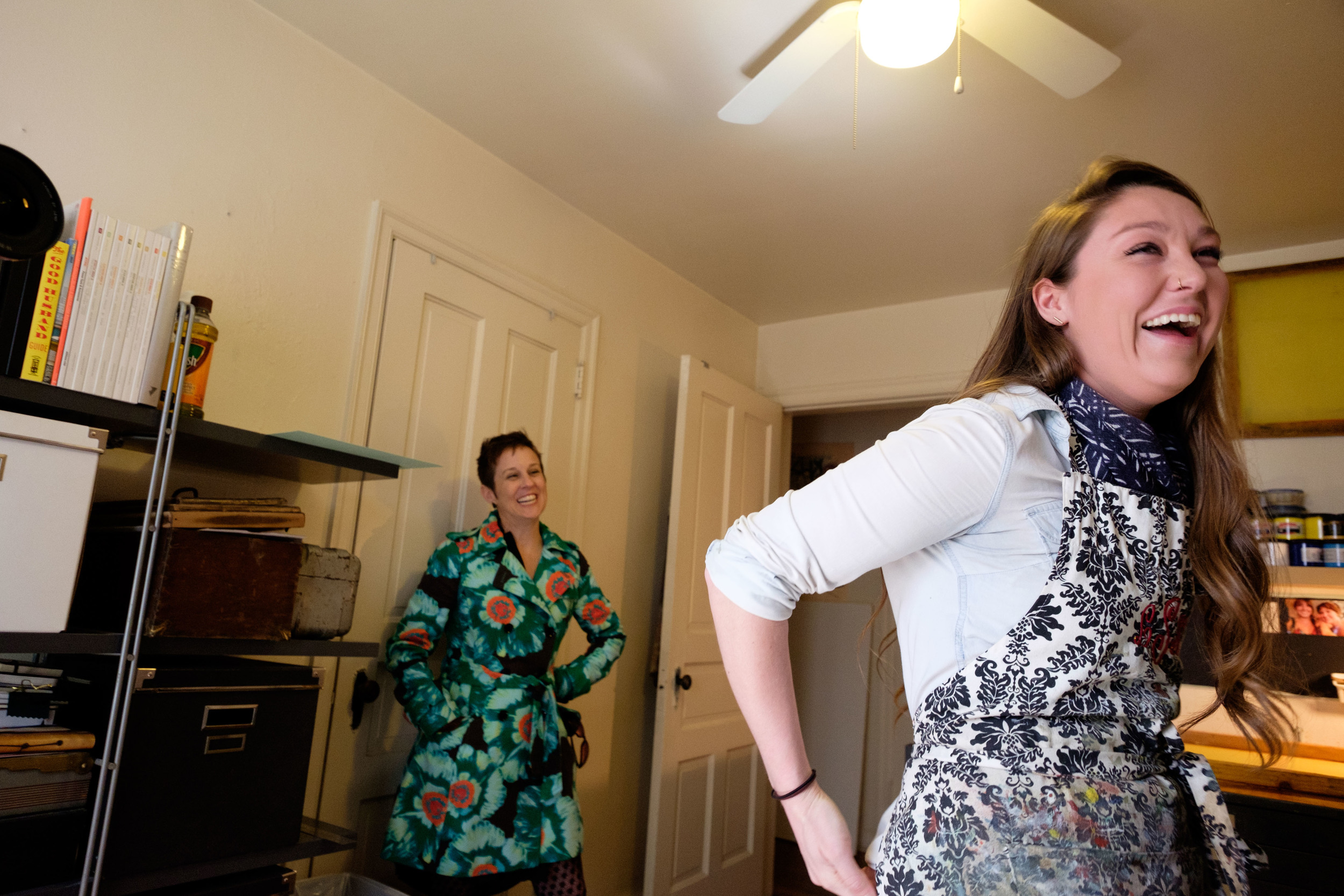
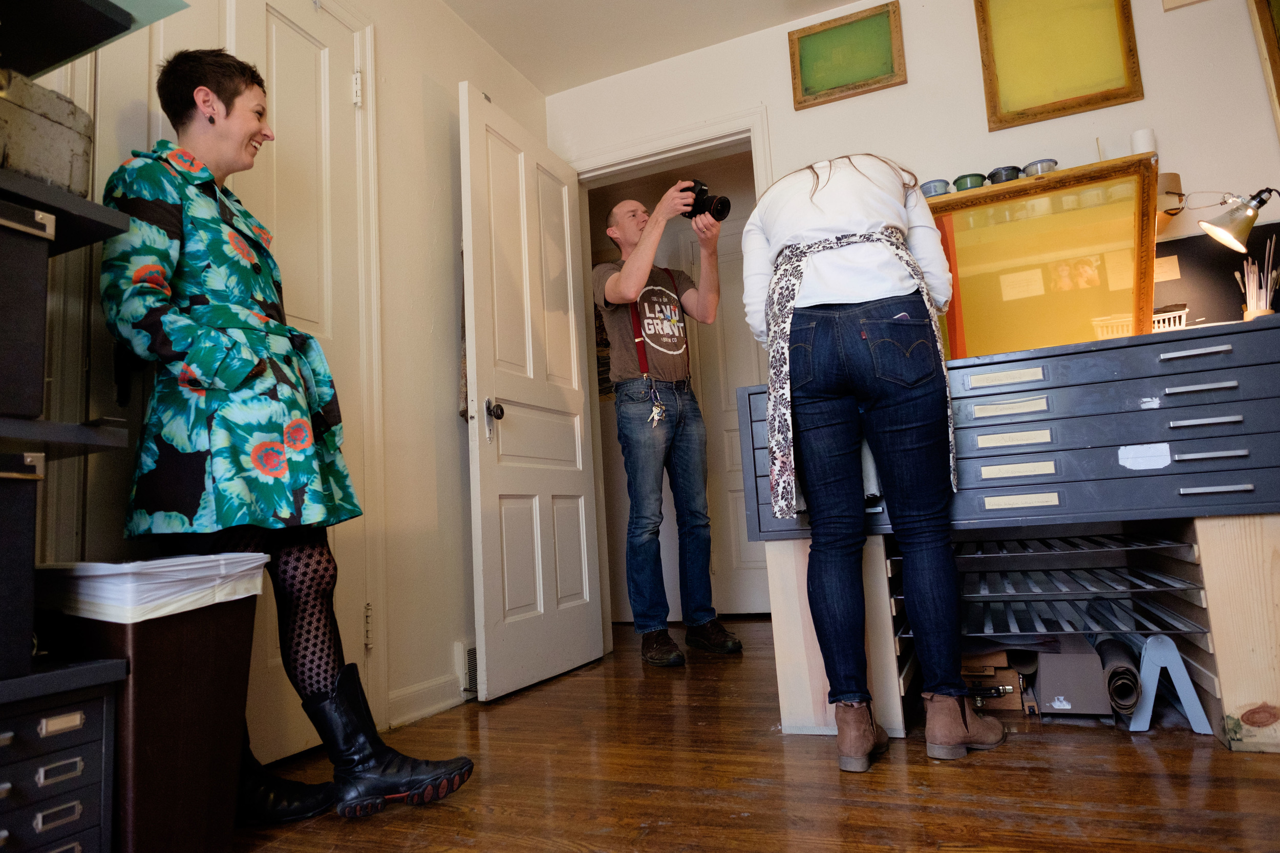
WOSU’s “Broad and High” at Leah Storrs’ Studio today
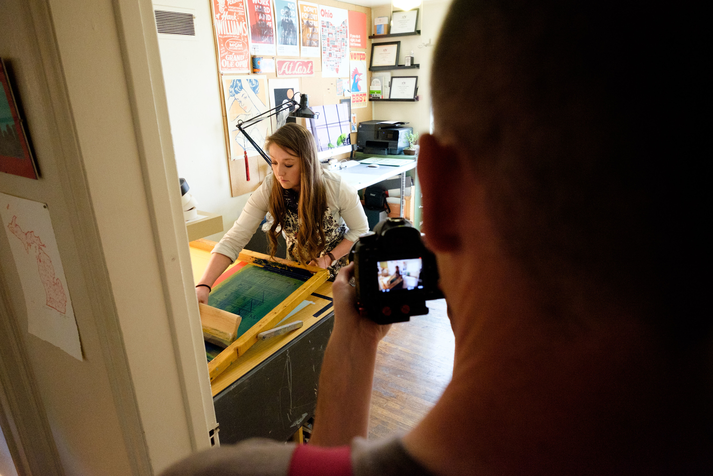
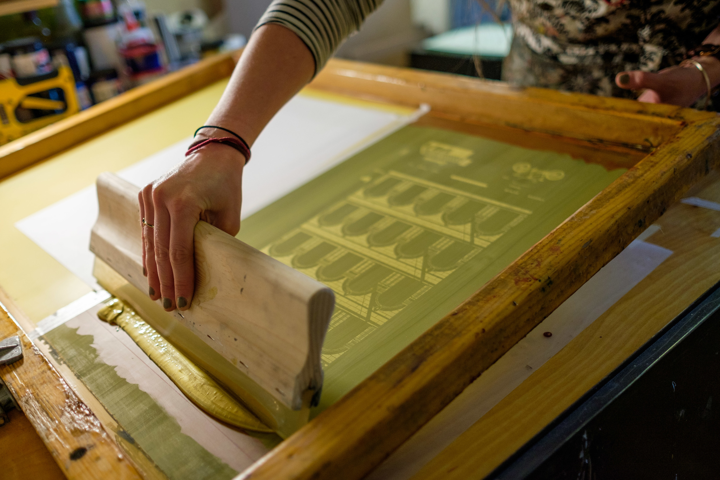
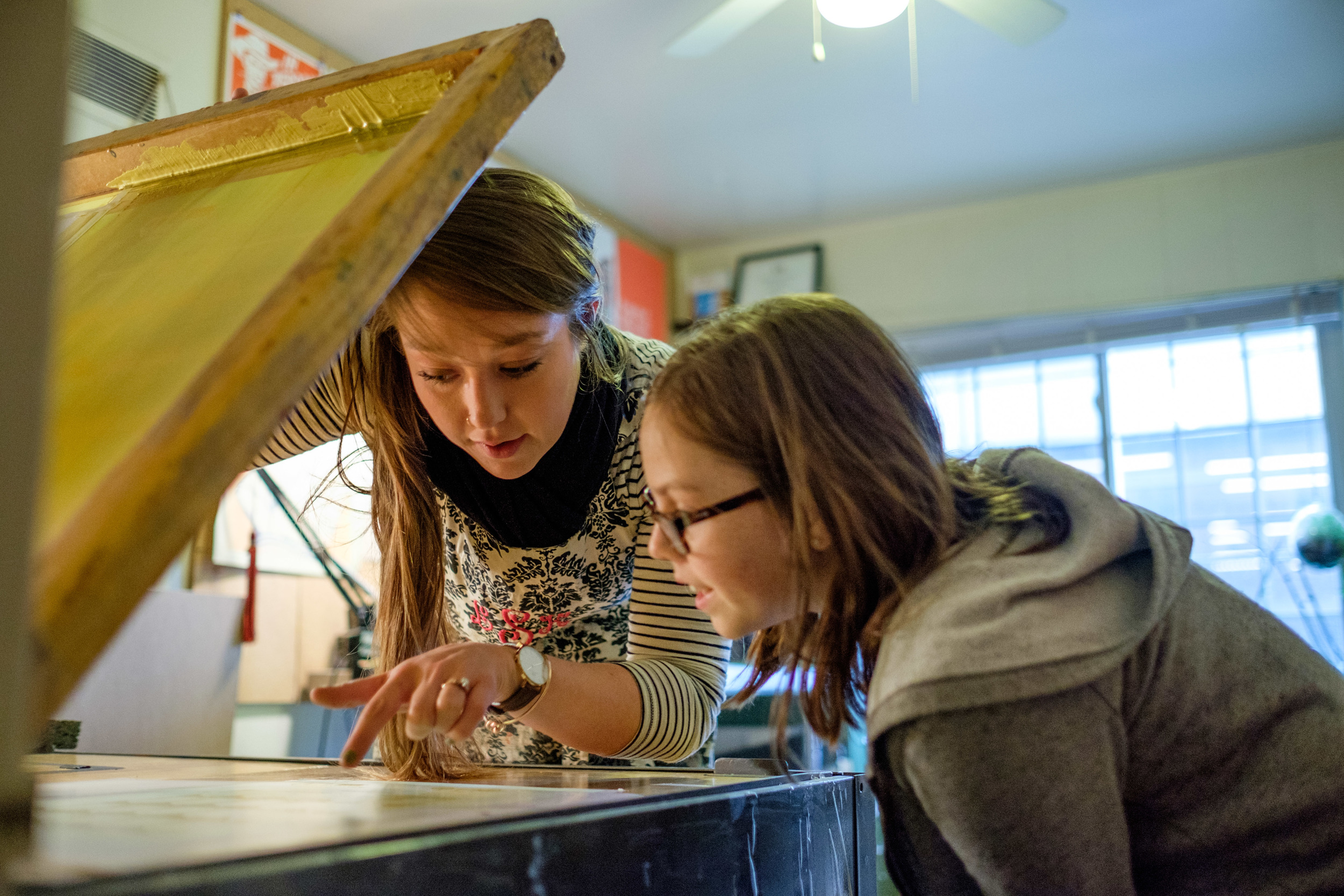
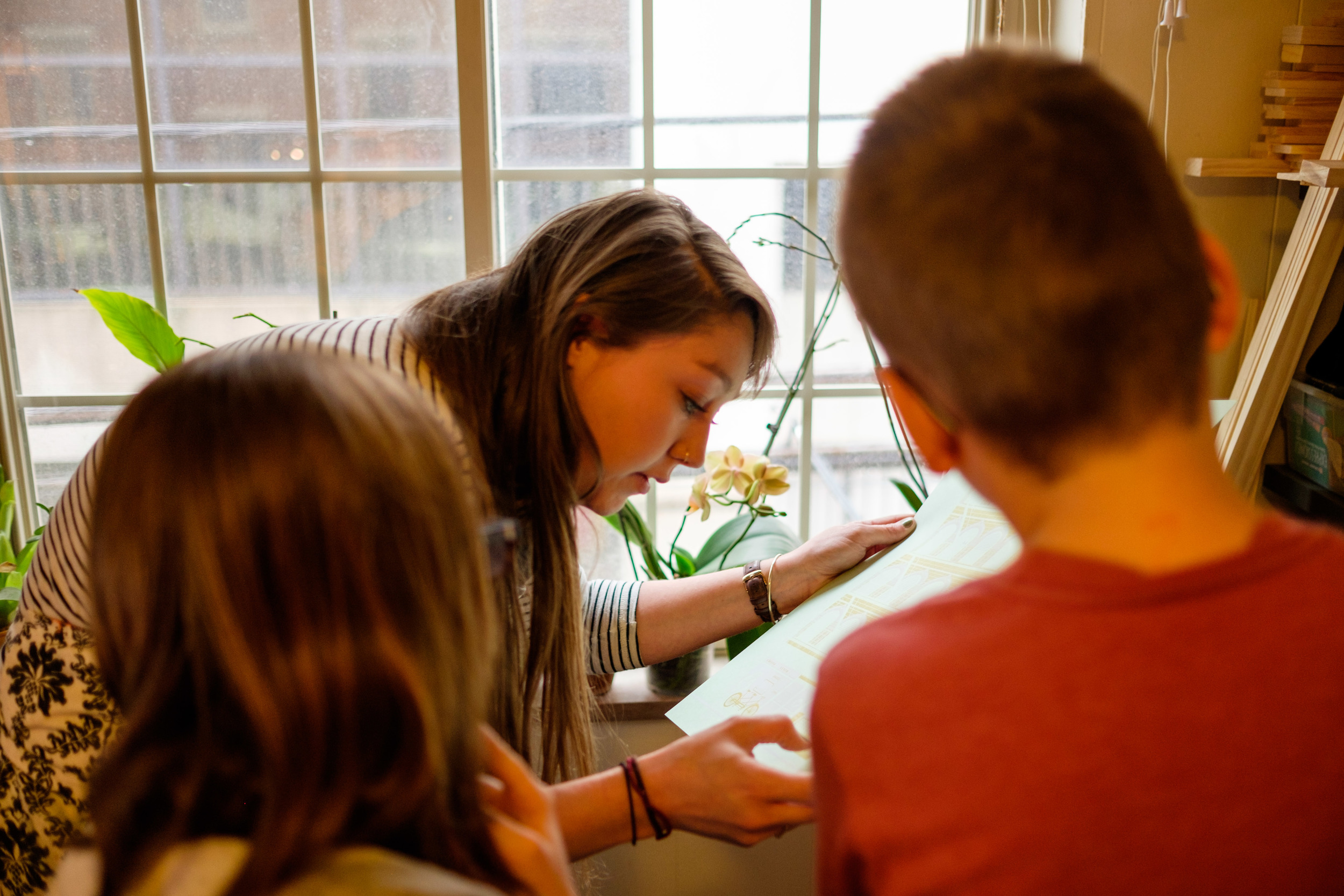
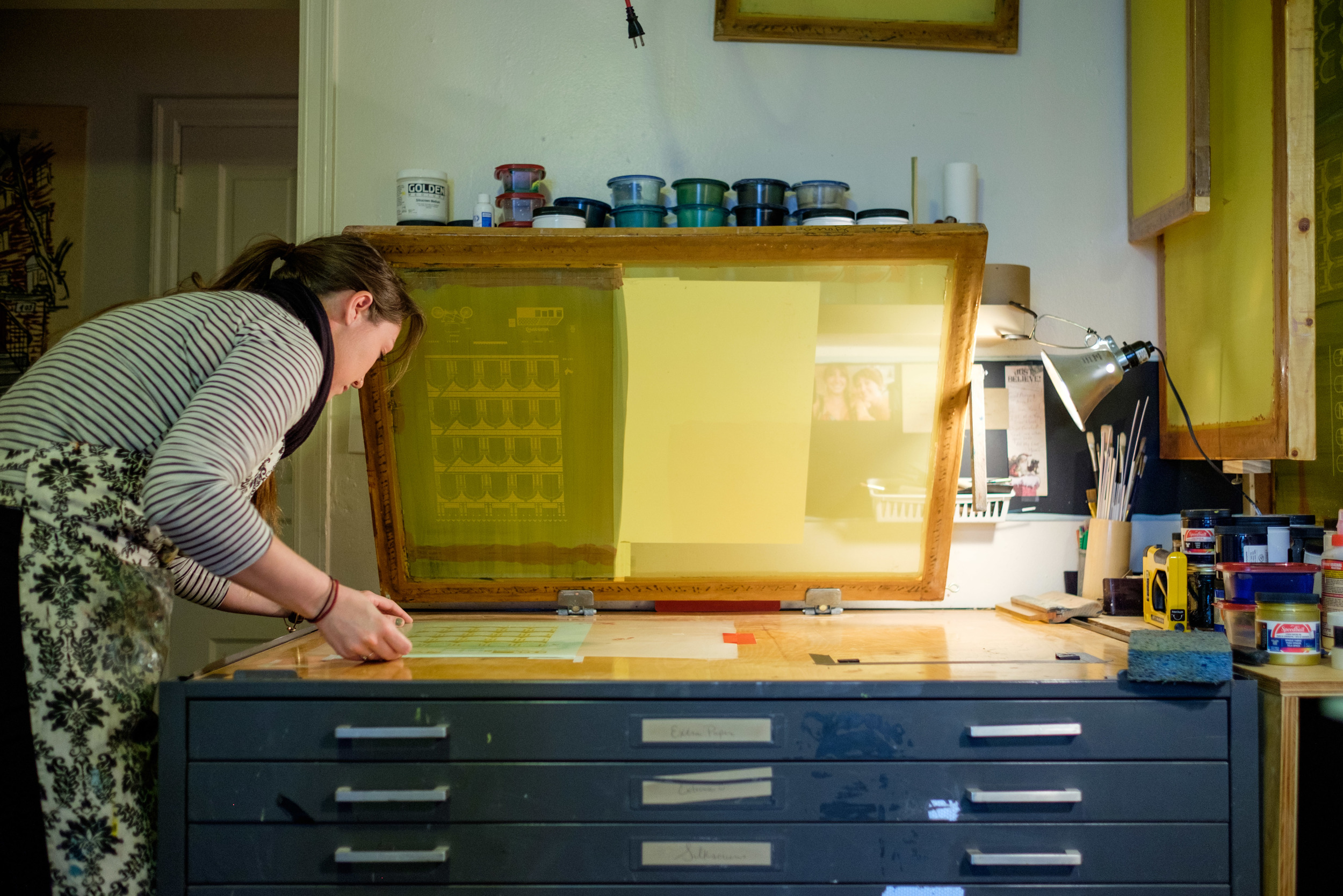
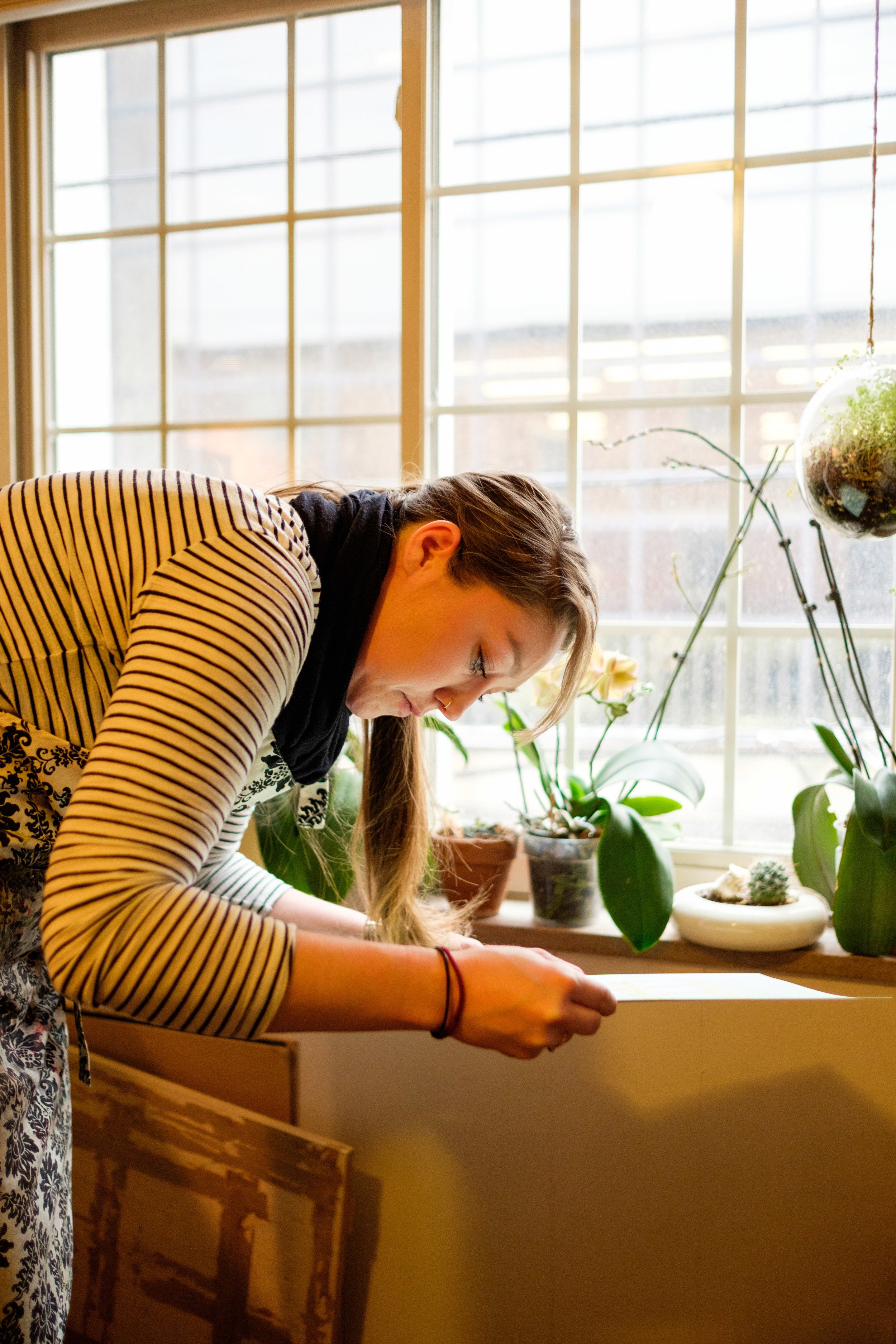
WOSU's Broad and High crew met us at Leah Storrs' studio to document the printing process for my 2016 Pinchflat Poster this afternoon. Leah is printing several of the prints in this year's show. Can't wait to see this episode!
Printing my 2016 Pinchflat poster
We dropped in at Leah Storrs' Studio today to check out the progress on my poster for this year's Pinchflat Bicycle Poster Blowout. She was printing the metallic gold ink and it's looking good! Thanks Leah!
WOSU is in the studio today!
Special thanks to WOSU (Columbus' PBS affiliate) for covering Pinchflat this year. They came by the studio today to interview me and document my process in creating silkscreen printed art for the event. Next week they will be shooting us in the print shop as Leah Storrs prints the posters, then on to the event in May where they will be covering all of the action. The story will be featured on Broad and High in an episode airing later in the year.
So come by Pinchflat on May 7 to support local artists, buy cool art, and get your smiling face on the show!
My 2016 Pinchflat Poster
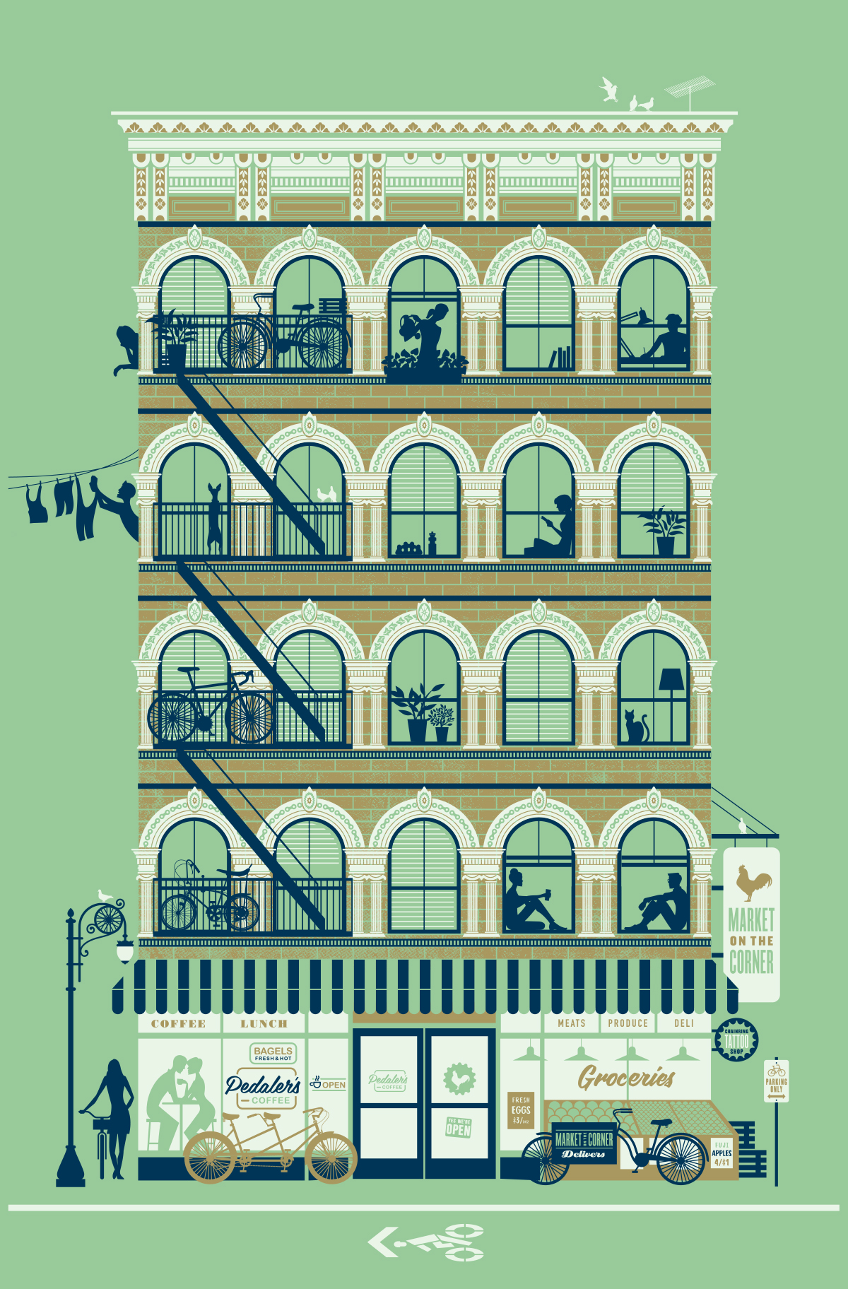
I'm super excited to see this poster get printed by the talented Leah Storrs. This year's poster is based on a mash-up of some cool buildings I photographed while in New York a few years ago.
Many artists have attempted to create their view of a utopian society. Thomas Kinkade paints his idealistic nature scenes, Norman Rockwell painted early mid-century American life, this poster is based on what the urban bicyclist might consider the perfect place to live.
Come out to Pinchflat 6 on Saturday, May 7 to check out other Ohio artists' work and take a few posters home with you. All art is only $30 each and 75% goes to the artist. More information at www.pinchflatcolumbus.com.
The poster will be 12.5 x 19 (can be matted or framed at 11 x 17), printed in three-color silk screen (including gold metallic) on French Spearmint Pop-Tone 100# cover stock.
Early morning walk to Starbucks
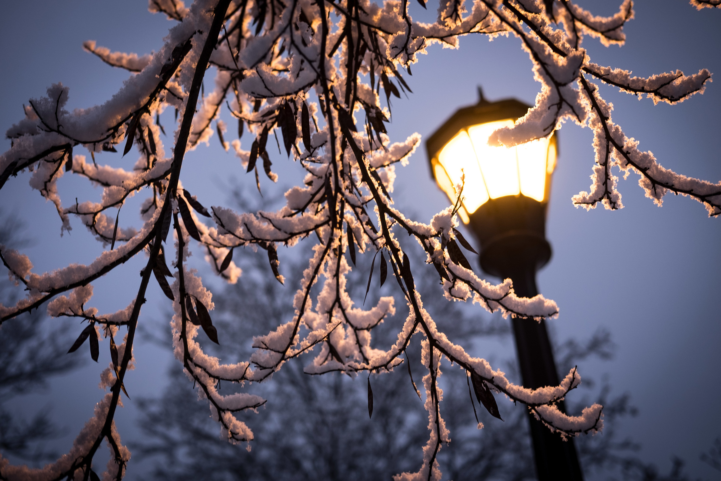
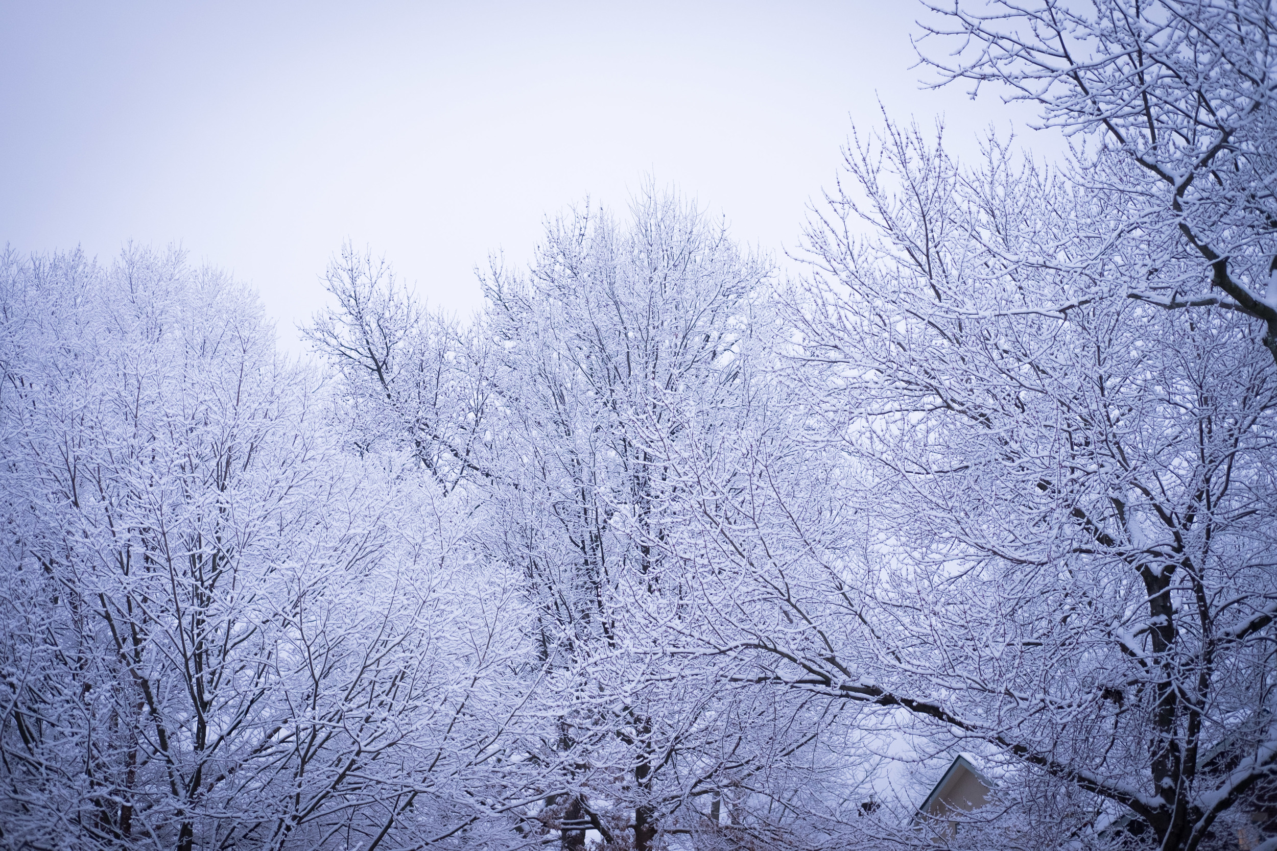
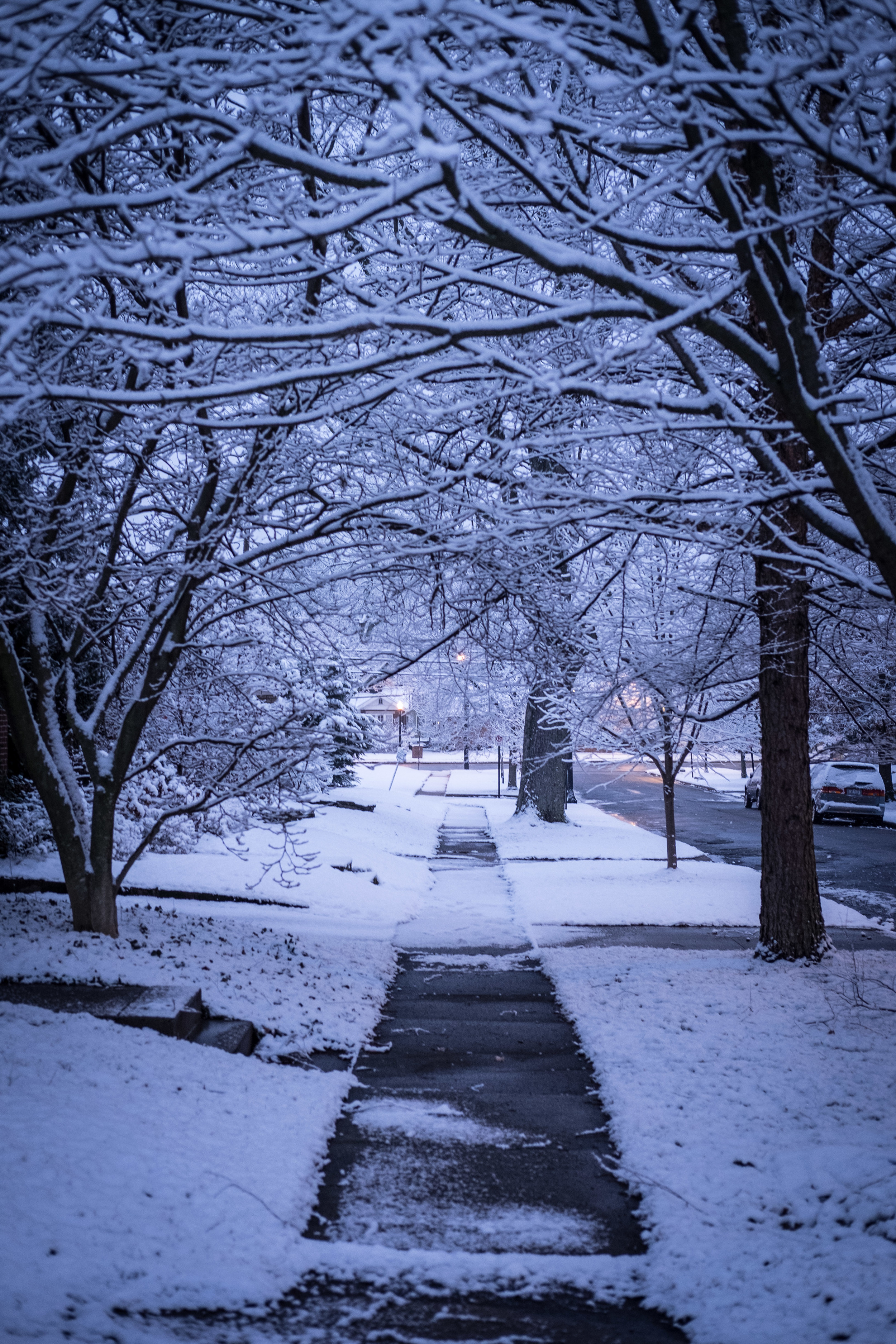
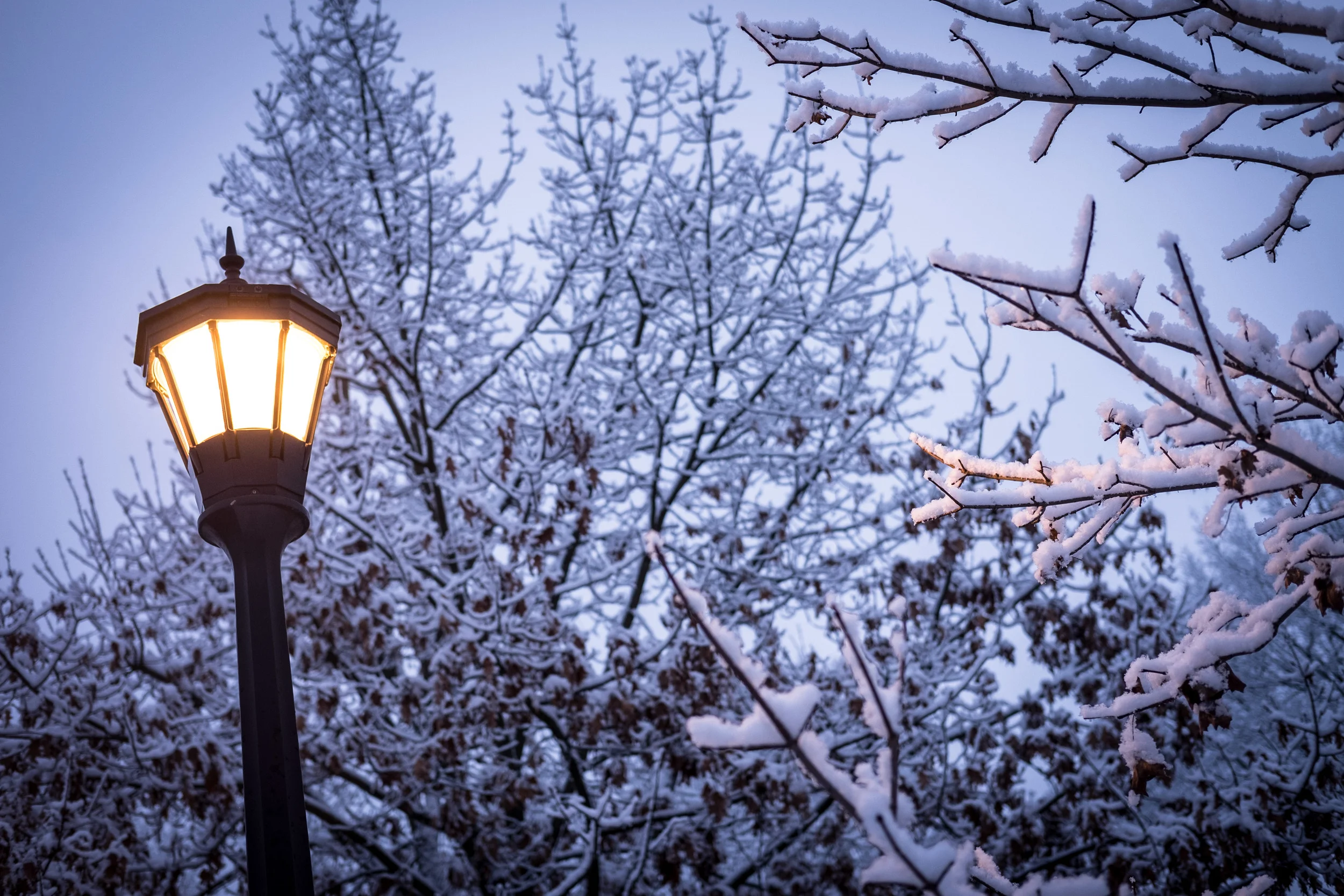
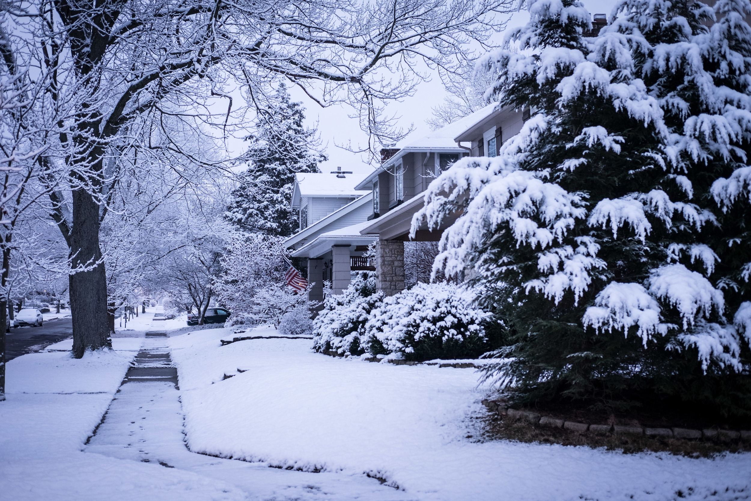
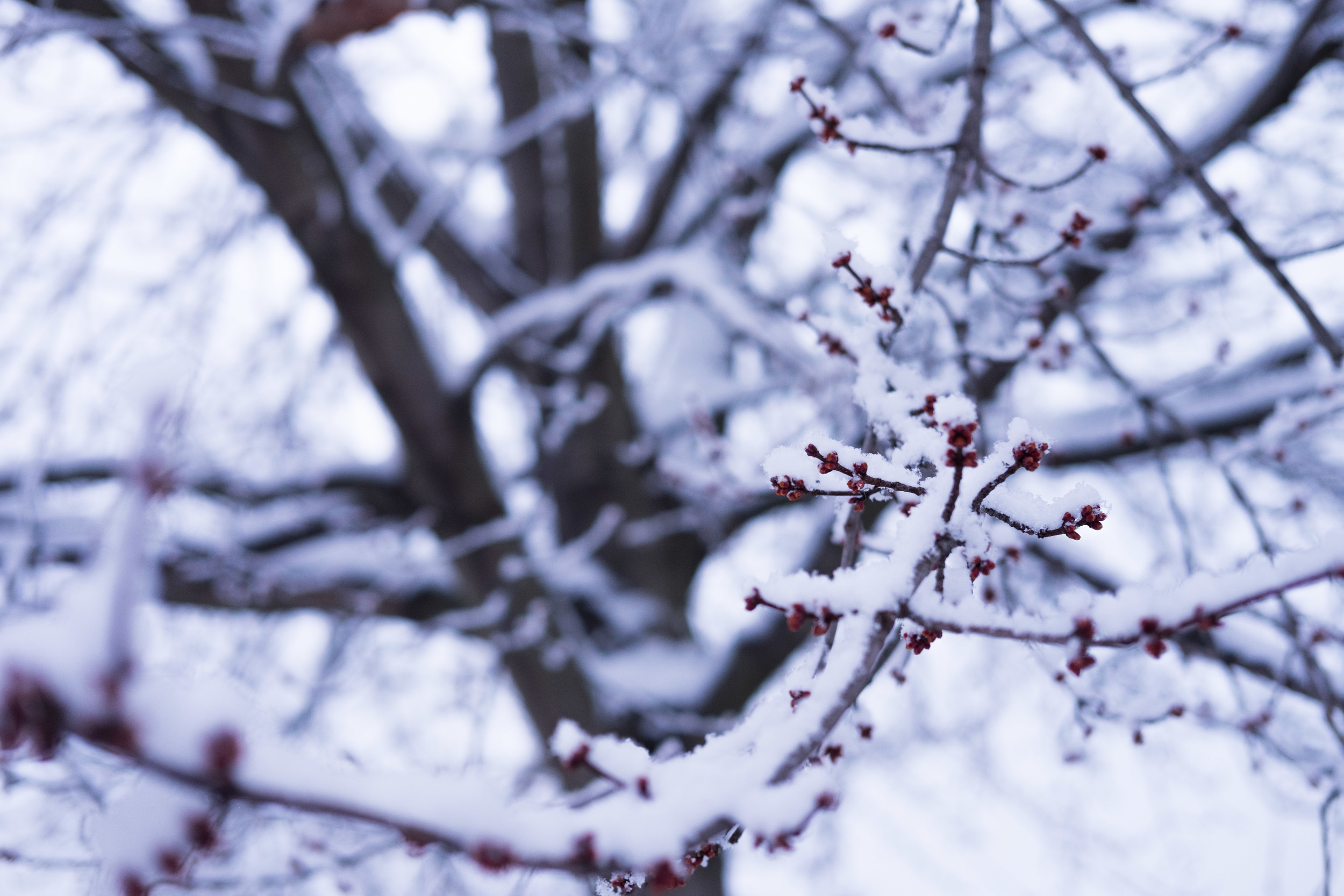
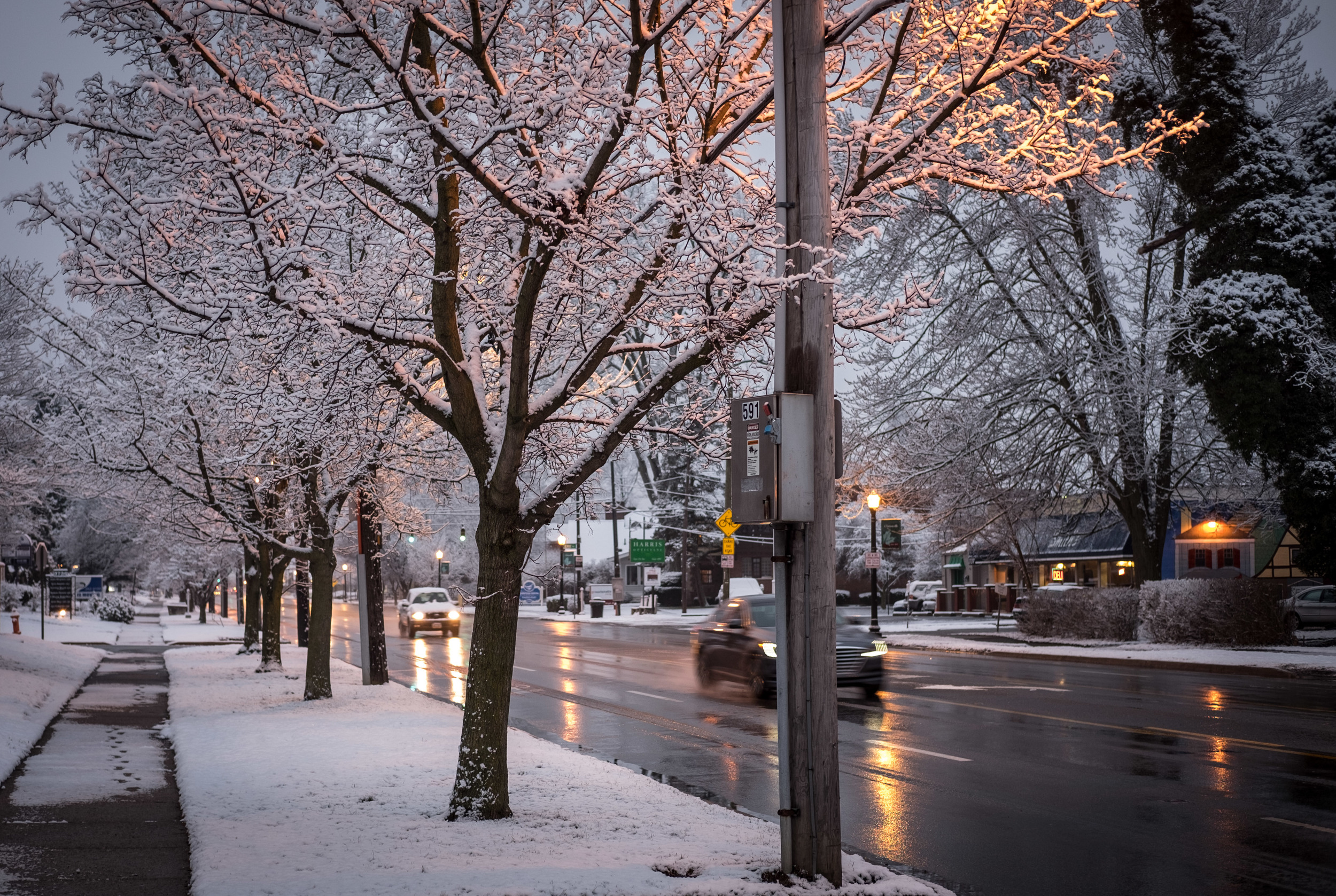
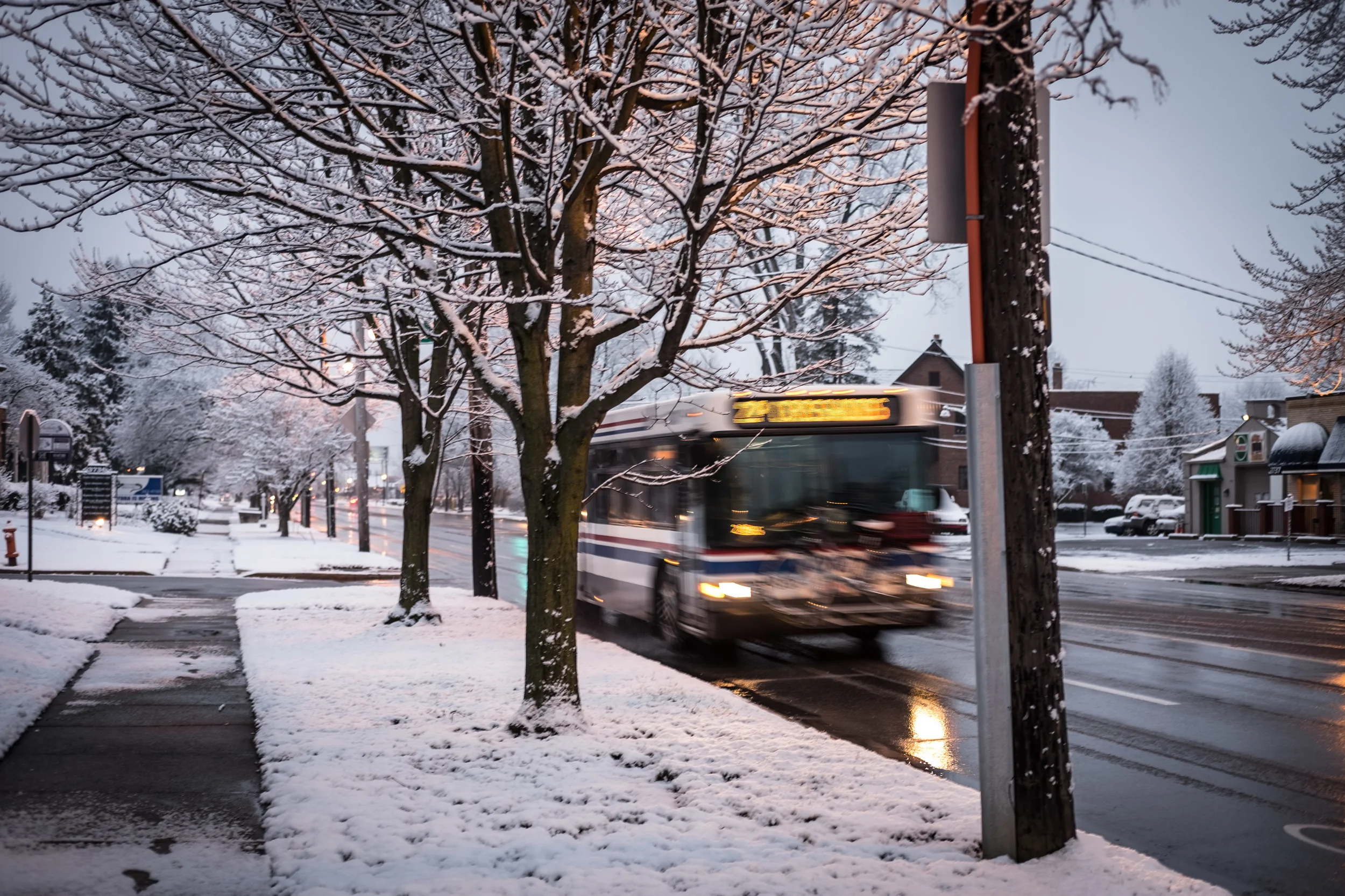
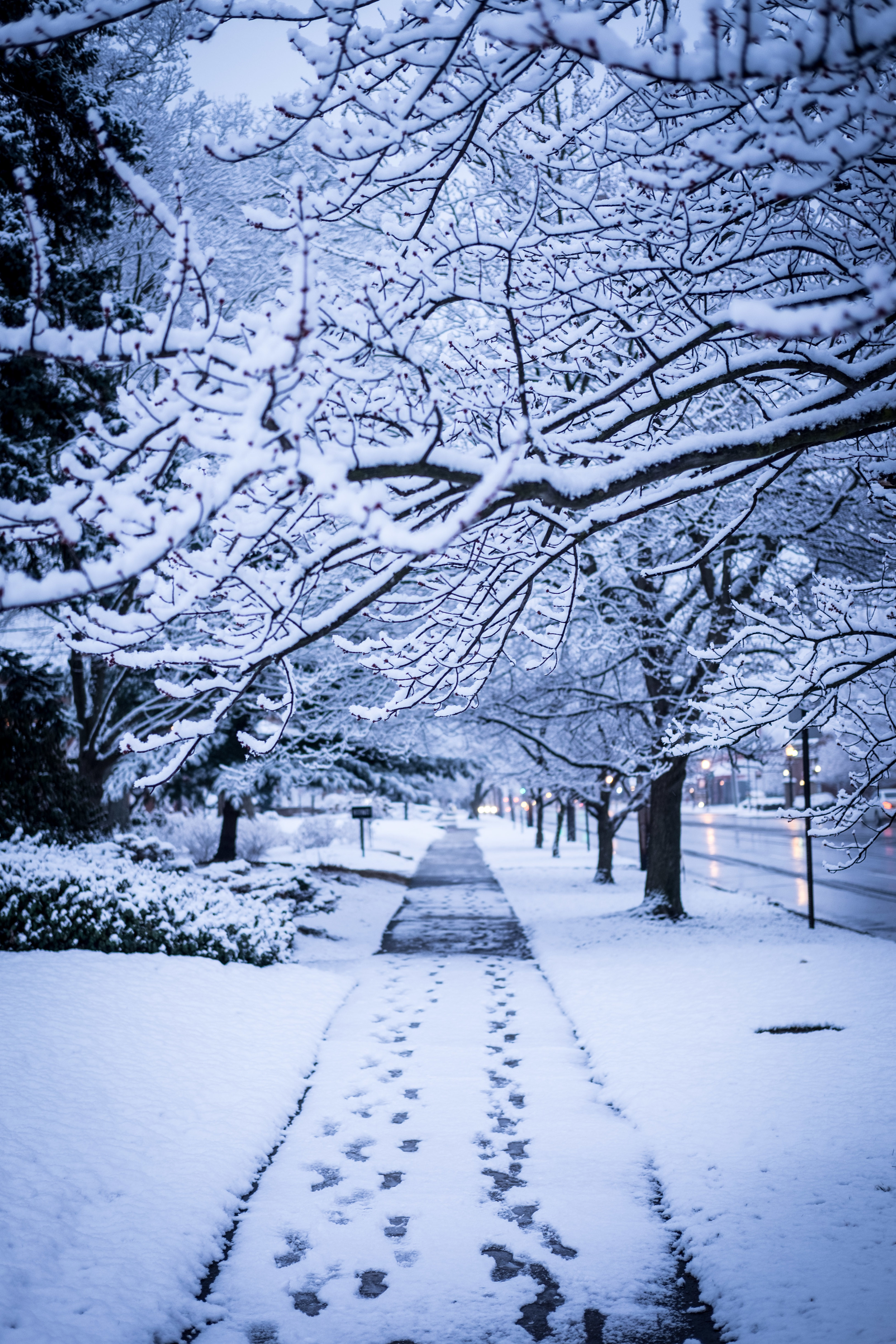
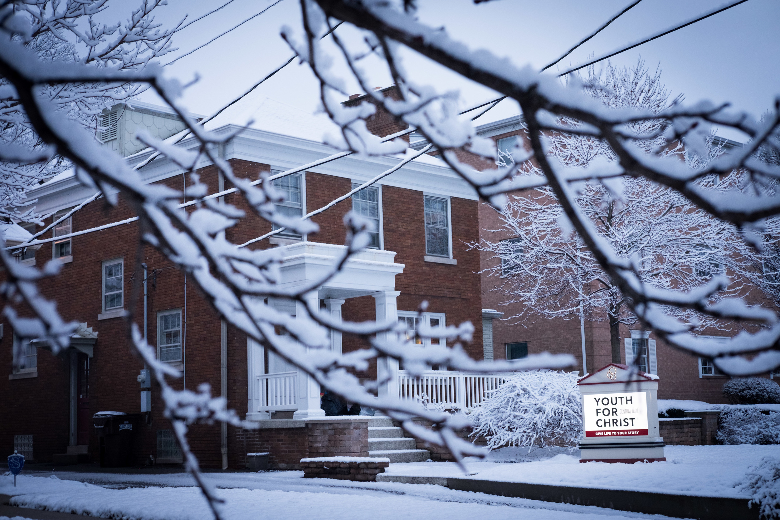
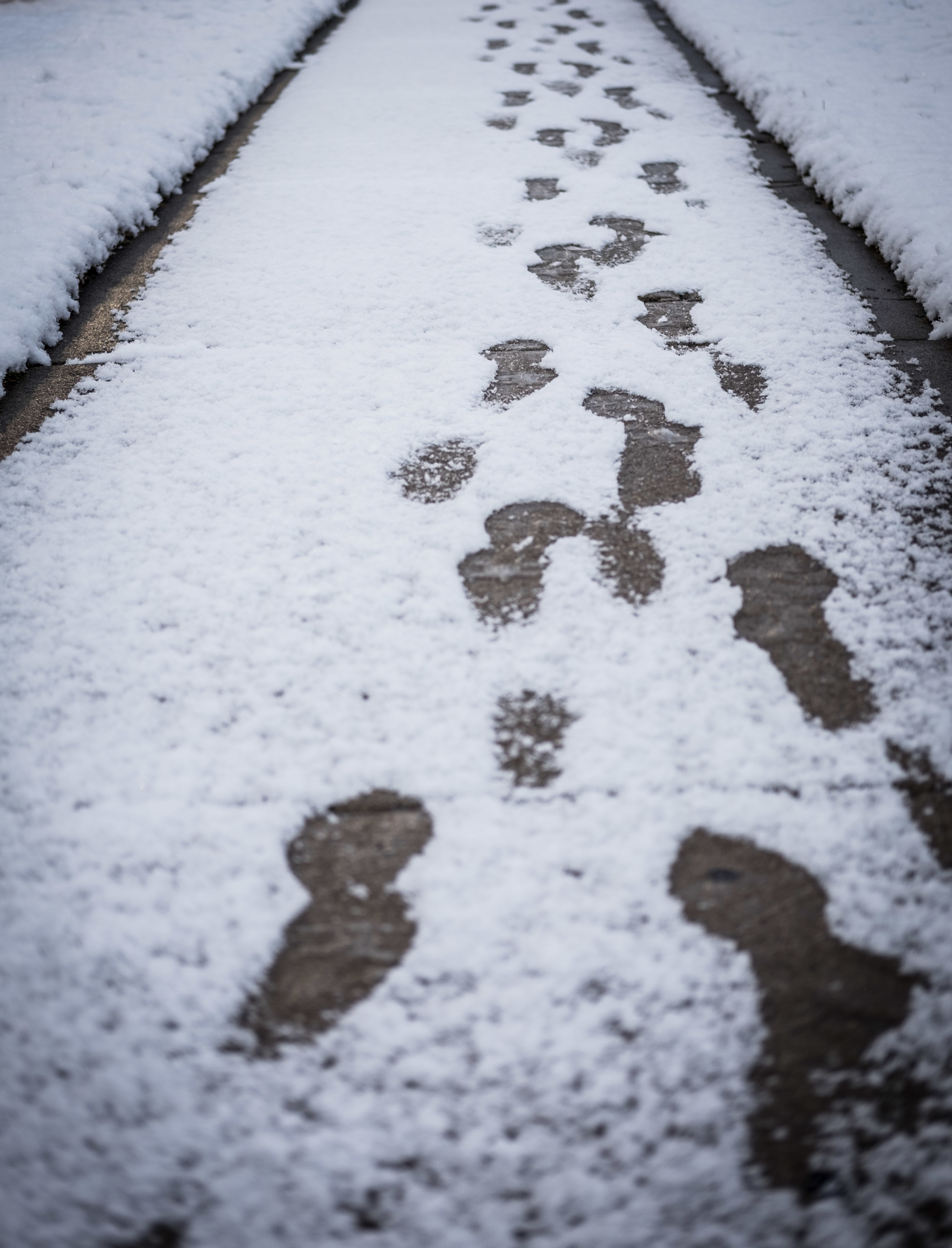
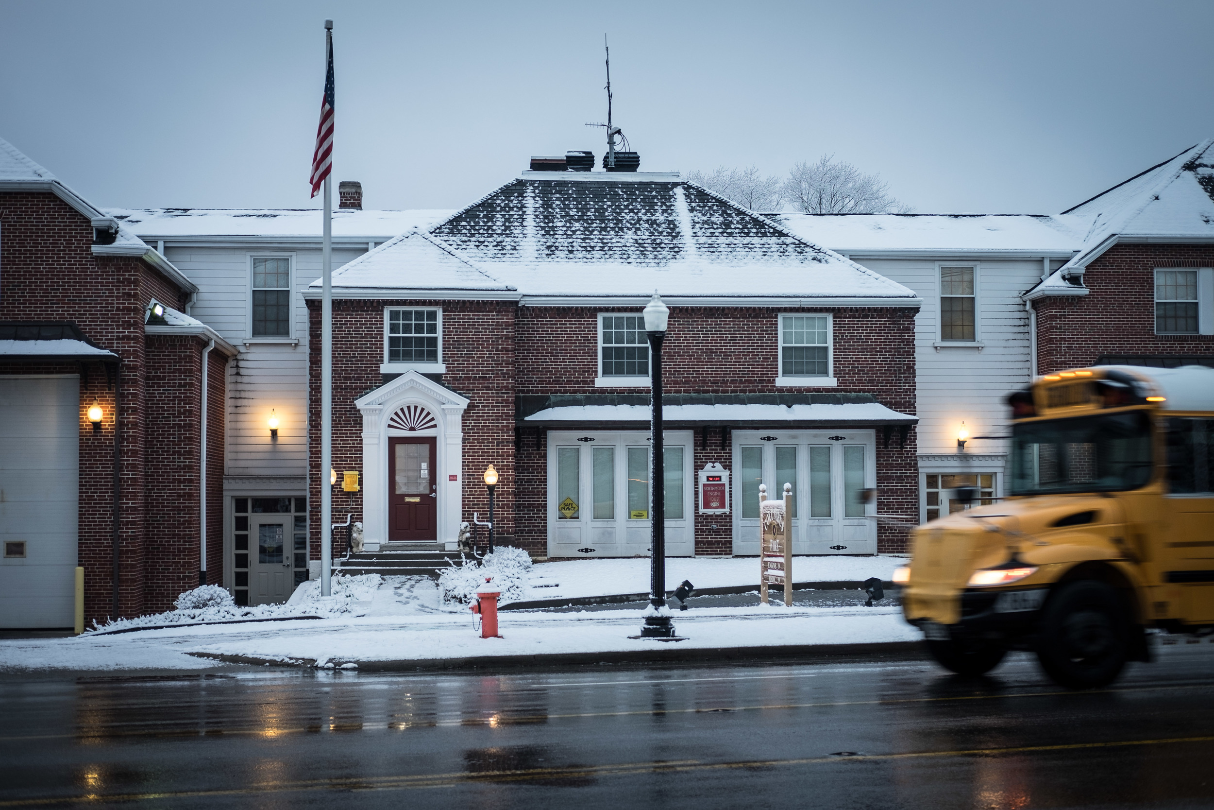
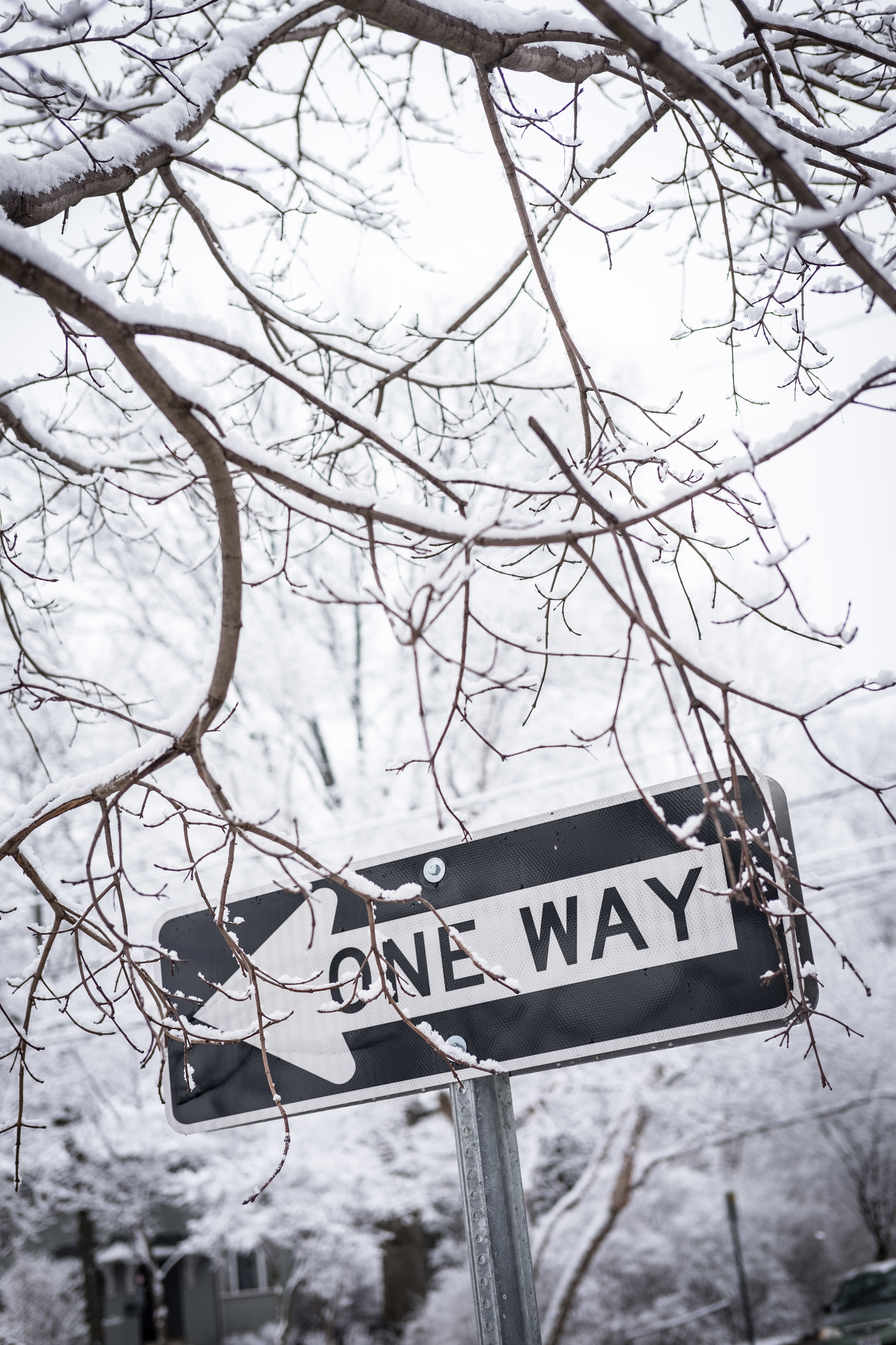
I love my on-going early Friday meetings with Stacy Keyerleber. We meet to plan the second annual Edugo Road to Success Ride happening this October. It's the most life-giving thing I do. This is one of those mornings that make me glad that I always have my camera on me. My neighborhood is gorgeous under a fresh blanket of snow!


